StudioThinktank, Work
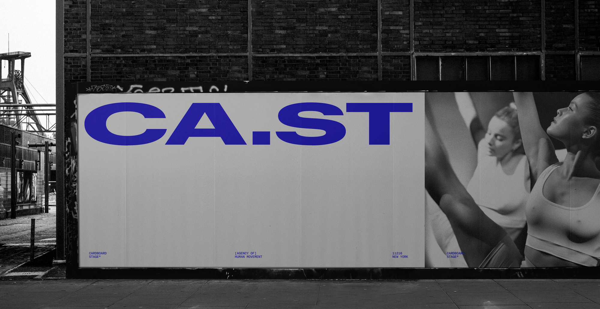
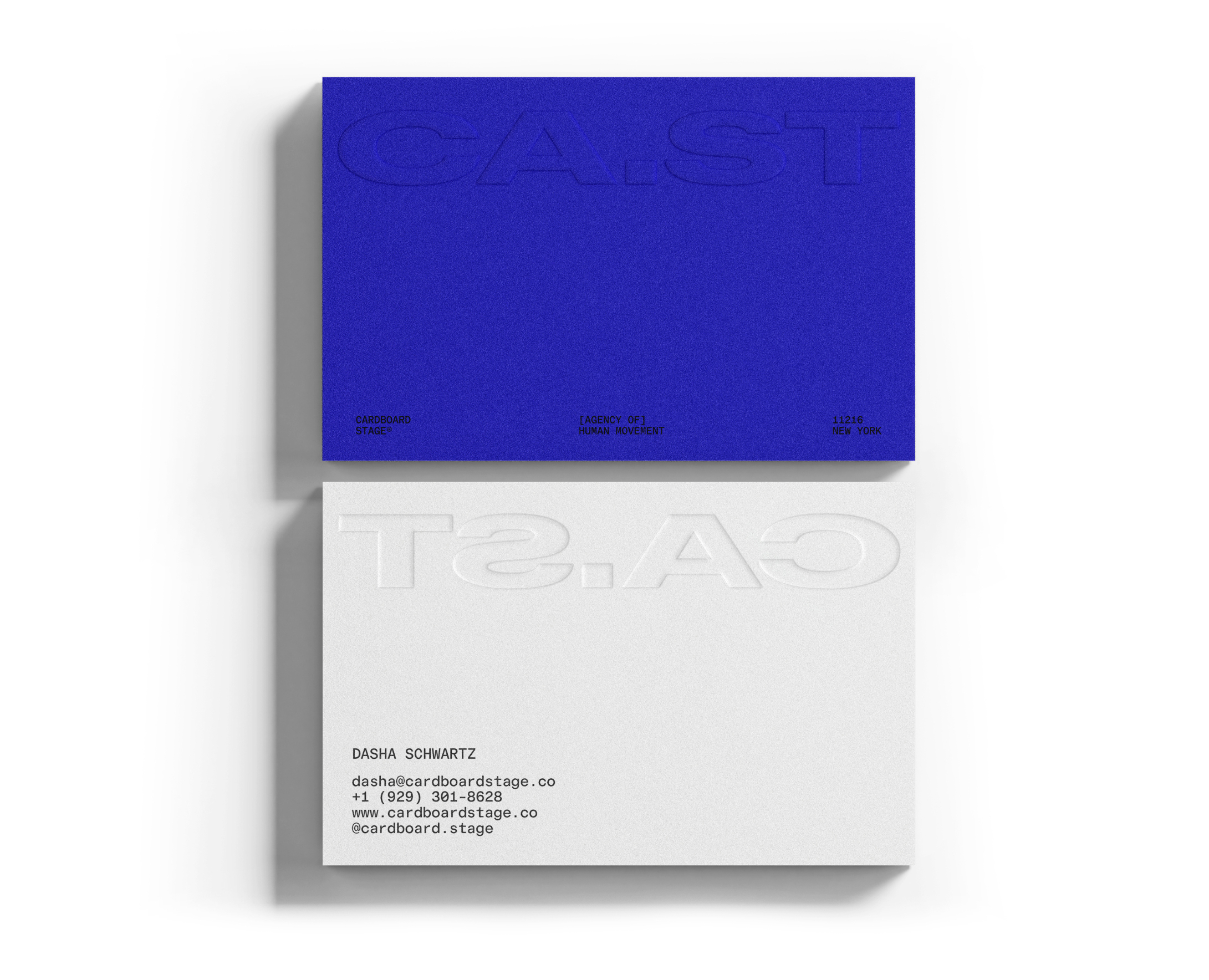
Cardboard Stage
Strategy, Creative Direction and Identity for the New York casting agency.


Cardboard Stage
[Agency of] Human Movement™
Brand Identity, Creative direction, Strategy [2025]
Cardboard Stage operates at the apex of New York’s dance landscape — the city’s premier casting agency for elite movement artists and performers. With deep connections to the New York City Ballet and the broader contemporary dance scene, the agency curates talent for brands, productions, and experiences that demand not just skill, but artistry.
Their work sits at the intersection of choreography, fashion, film, and culture.
StudioThinktank crafted an identity anchored in the notion of an “Agency of Human Movement” — a system that doesn’t simply represent dancers, but reflects the precision, fluidity, and expression that define them. The brand is intentionally restrained, allowing performance to dominate the frame while lending a quiet confidence to every touchpoint. The core icon becomes a study in distilled motion: a single, continuous gesture mapped from five defining points of a dancer’s form.
Minimal yet kinetic, it feels like a captured pulse — the lingering trace of movement after the body exits the frame. In motion, the icon transitions seamlessly into the Cardboard Stage logotype, functioning as both a signature and a piece of choreography in its own right. This gesture evolves into a dynamic masking system that shapes imagery, frames video, and guides composition across the brand’s visual world. It adapts effortlessly, shifting scale and proportion while maintaining a refined, cohesive language.
The result is a system that feels crafted, architectural, and alive — a visual echo of the performers it represents. The final identity positions Cardboard Stage not just as a casting agency, but as a creative force within New York’s cultural ecosystem — elevated, expressive, and unmistakably rooted in the art of human movement.
Team
Scott Mellor - Creative Director
StudioThinktank - Design and Identity
Ryan Walker - Motion Graphics
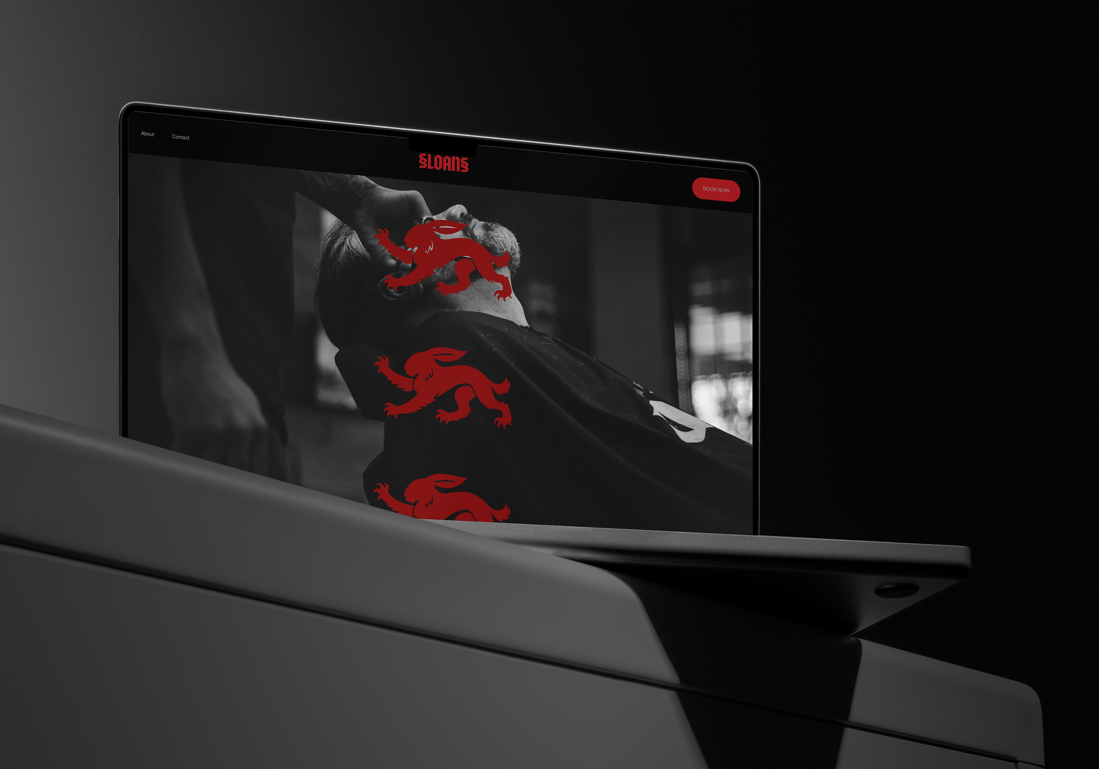
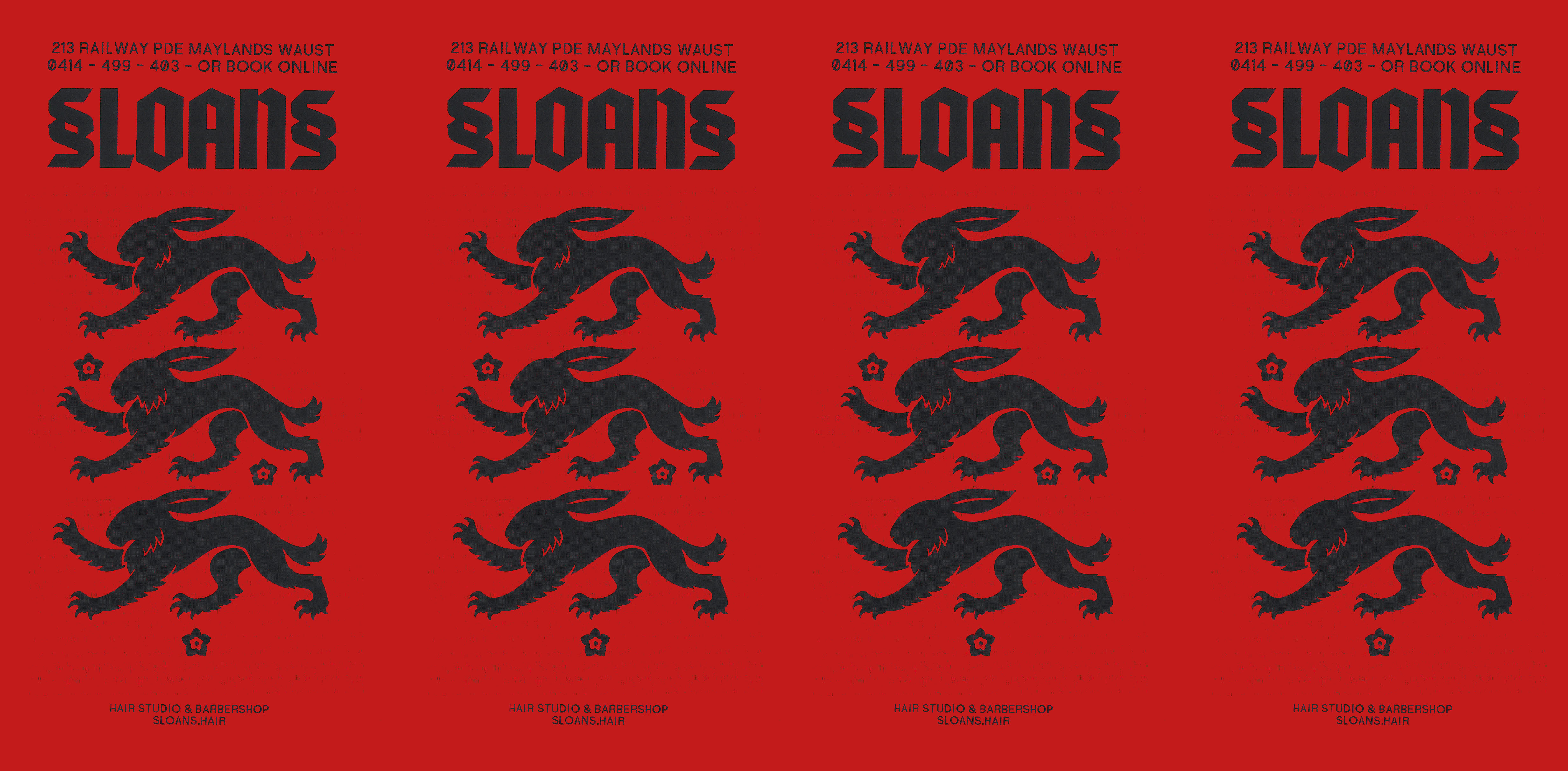
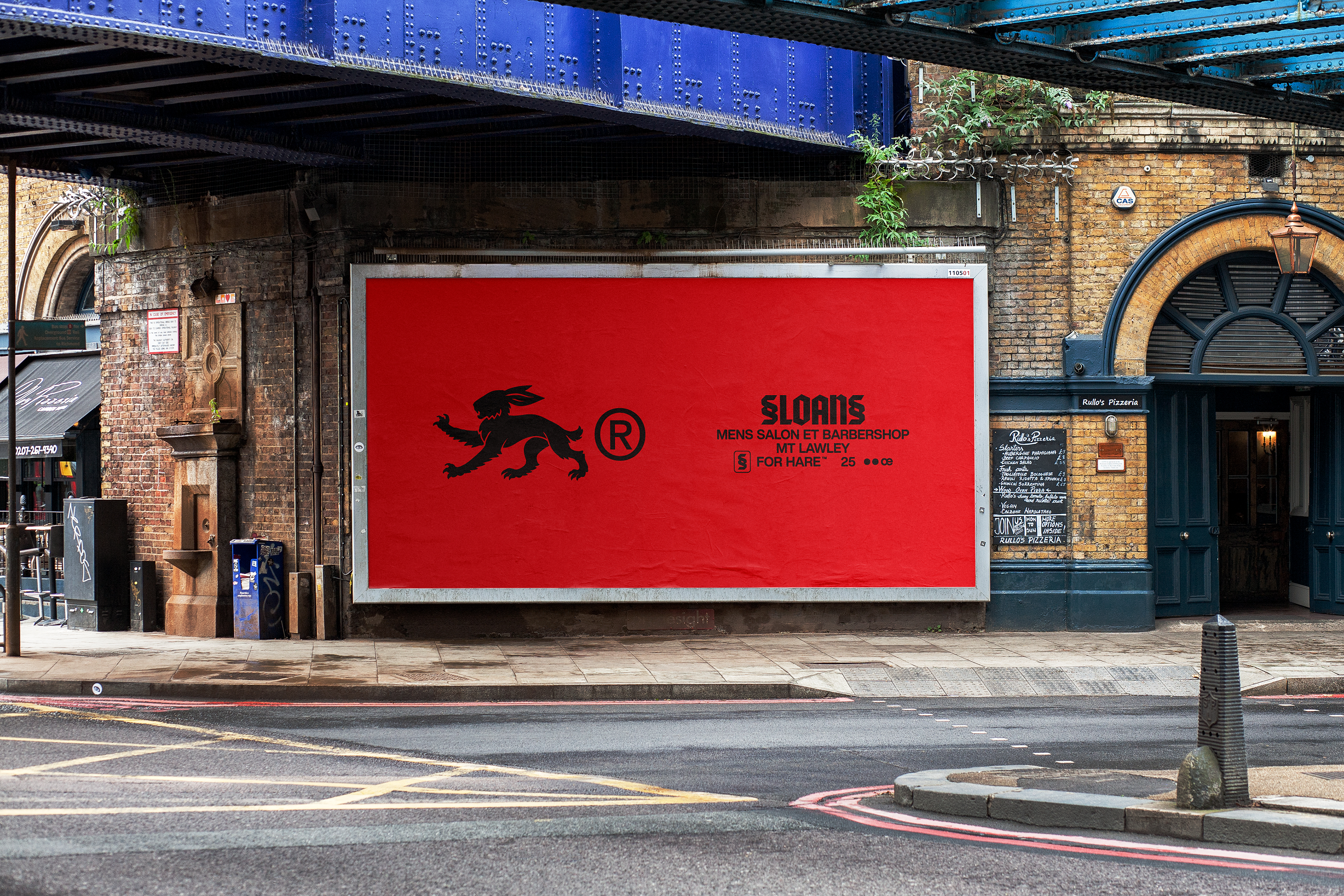
Sloans Gentleman’s Barbershop & Salon
— an identity defined by the hare
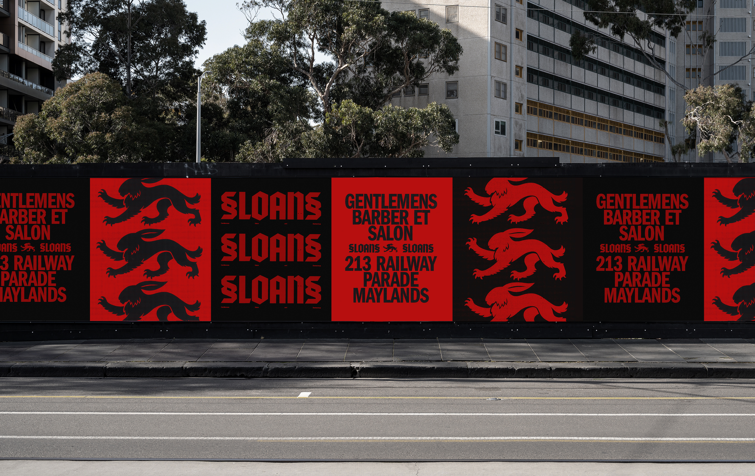
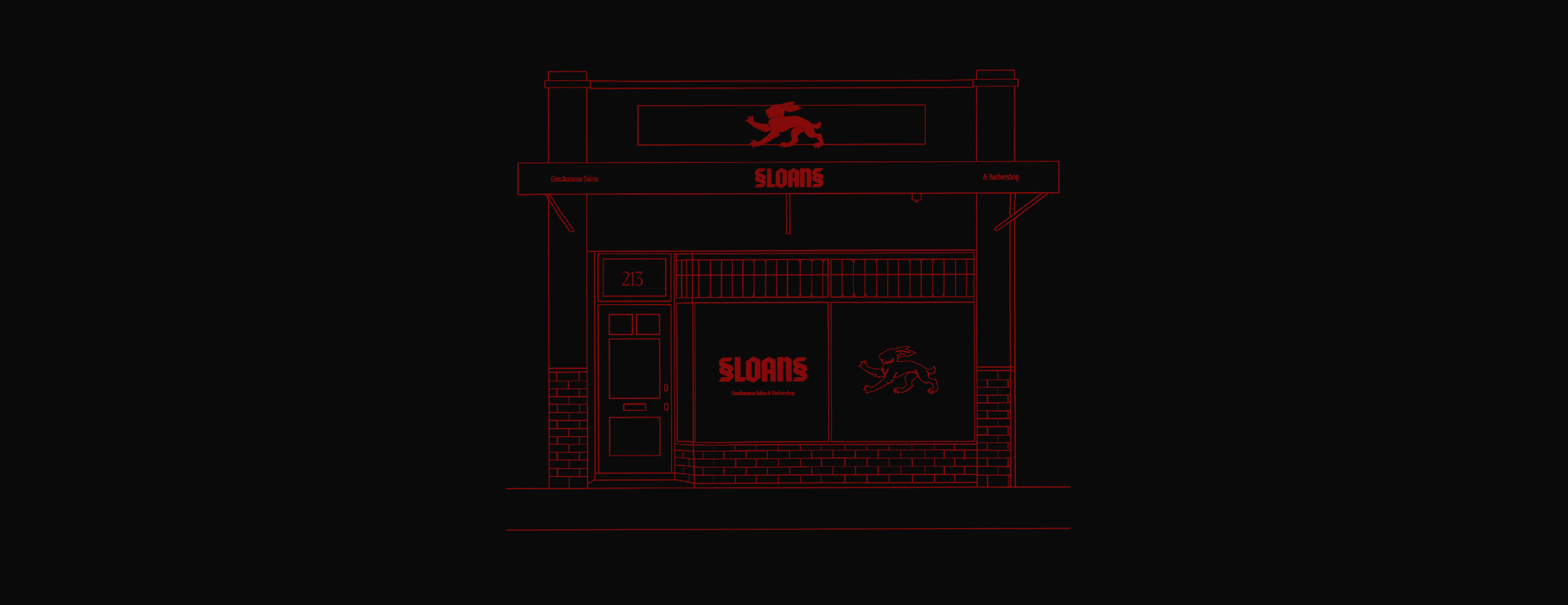
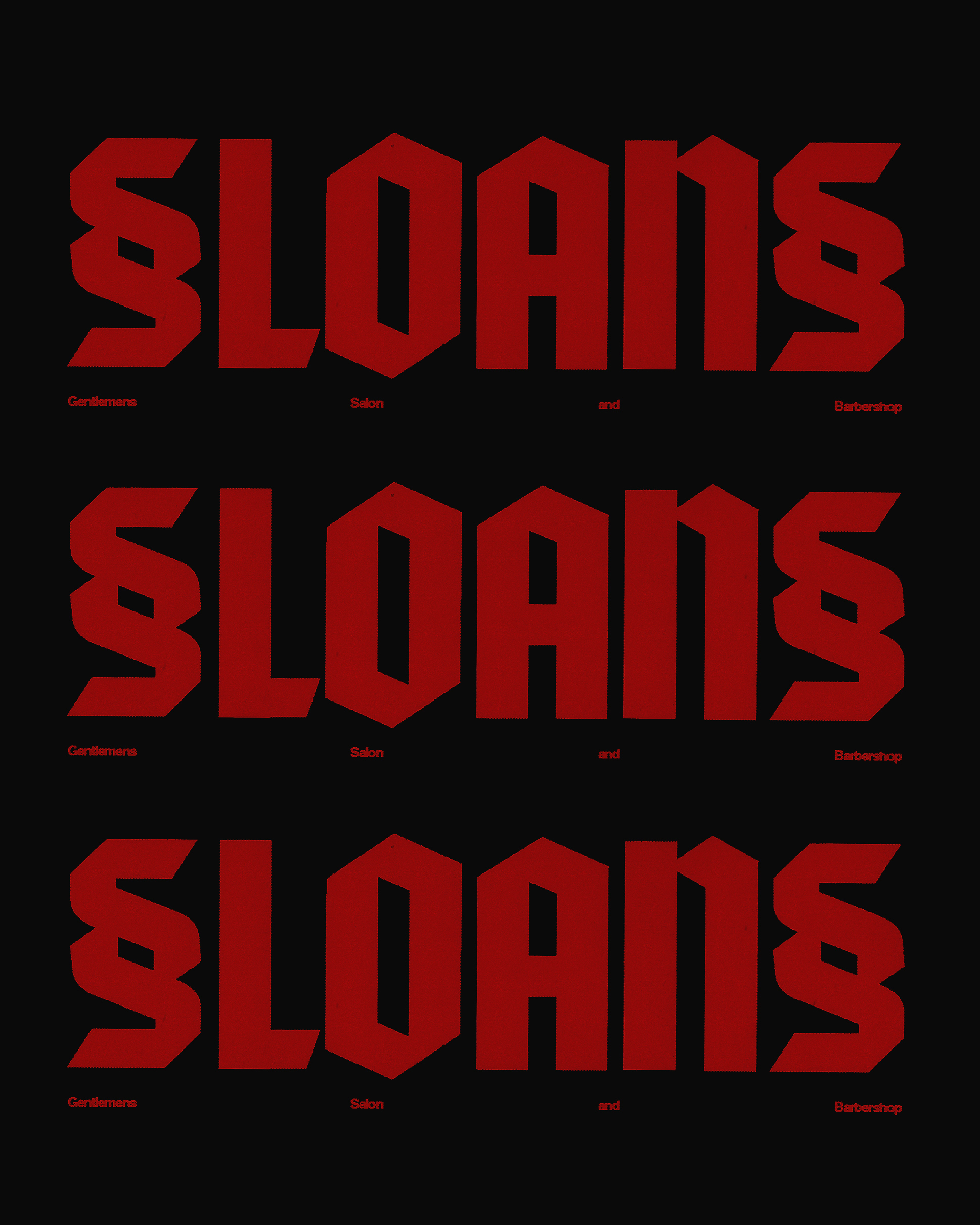
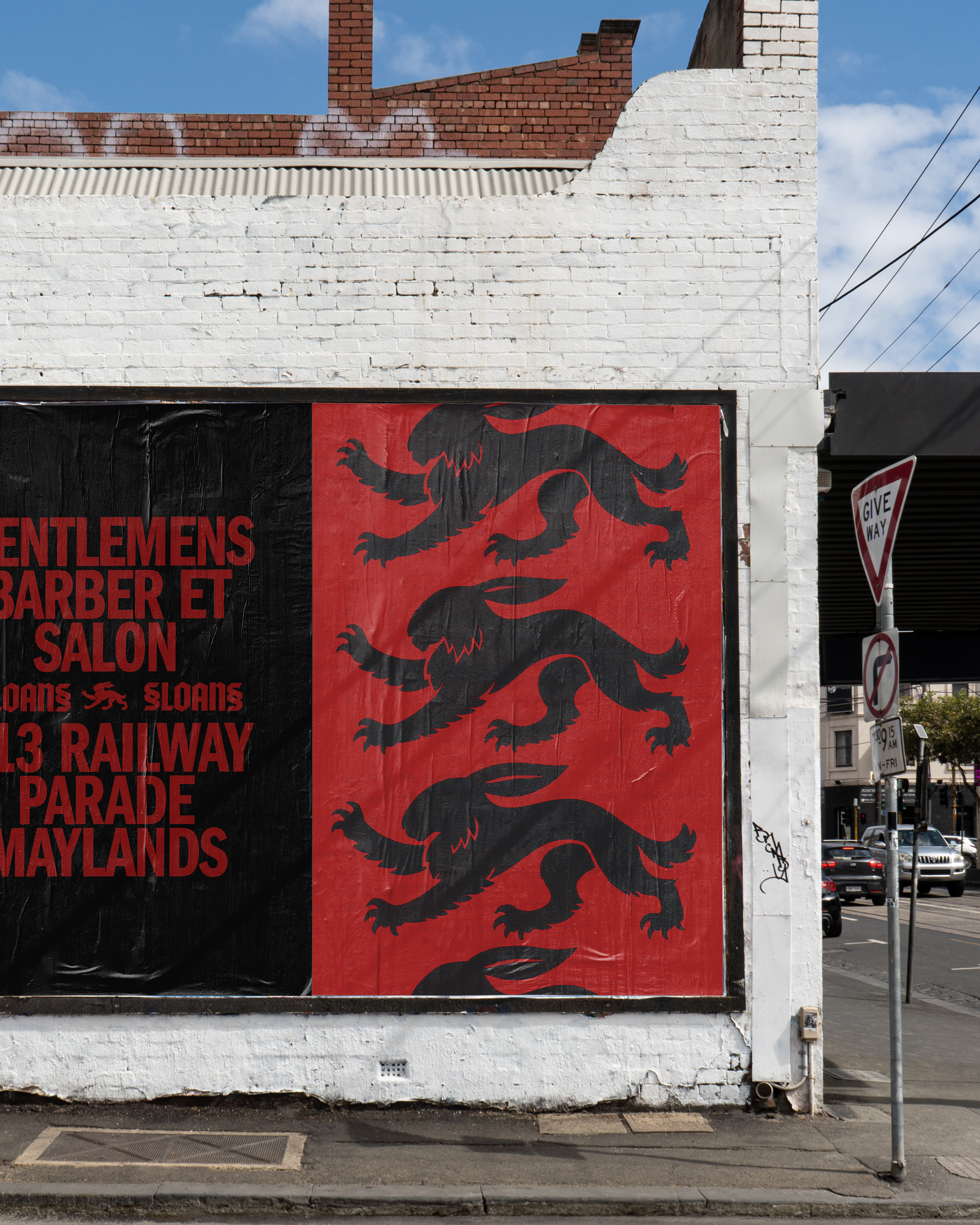
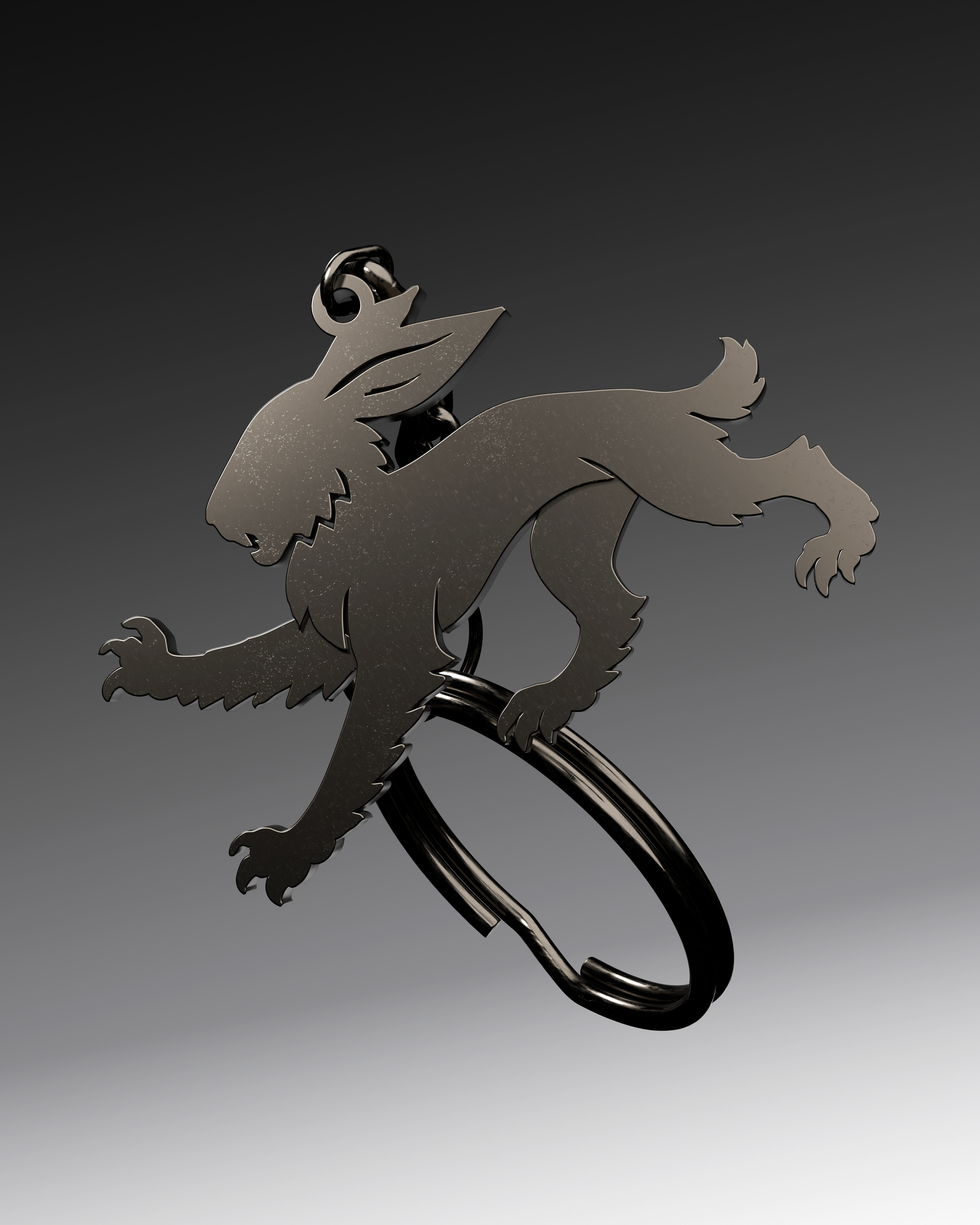
SLOANS
Brand Identity, Creative direction, Strategy
[2025]
Sloans Gentleman’s Barbershop & Salon — an identity defined by the hare, elevated as both moniker and coat of arms. Bold, iconic typography anchors the system with authority, balancing the hare’s emblematic power with a timeless sense of precision. Together they form a brand language built for legacy and expansion.
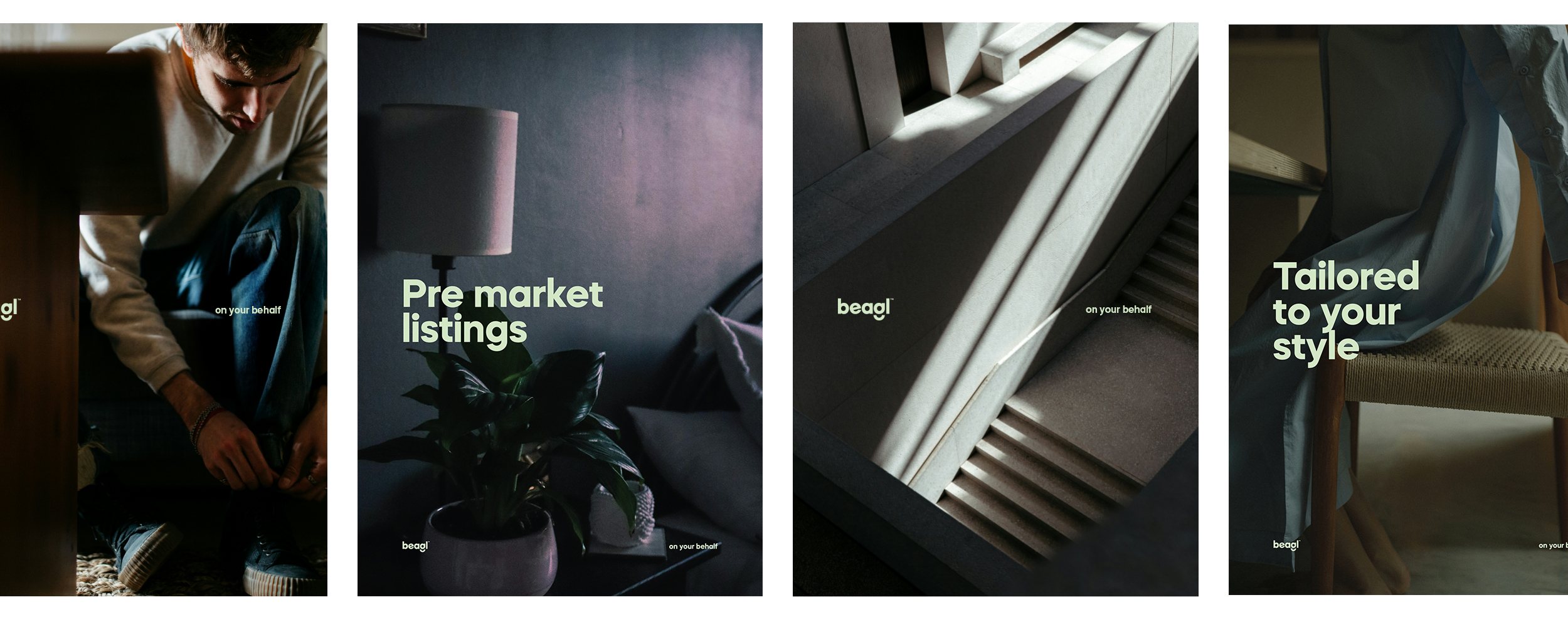
Beagl™
A full scale identity for the real estate market disruptor


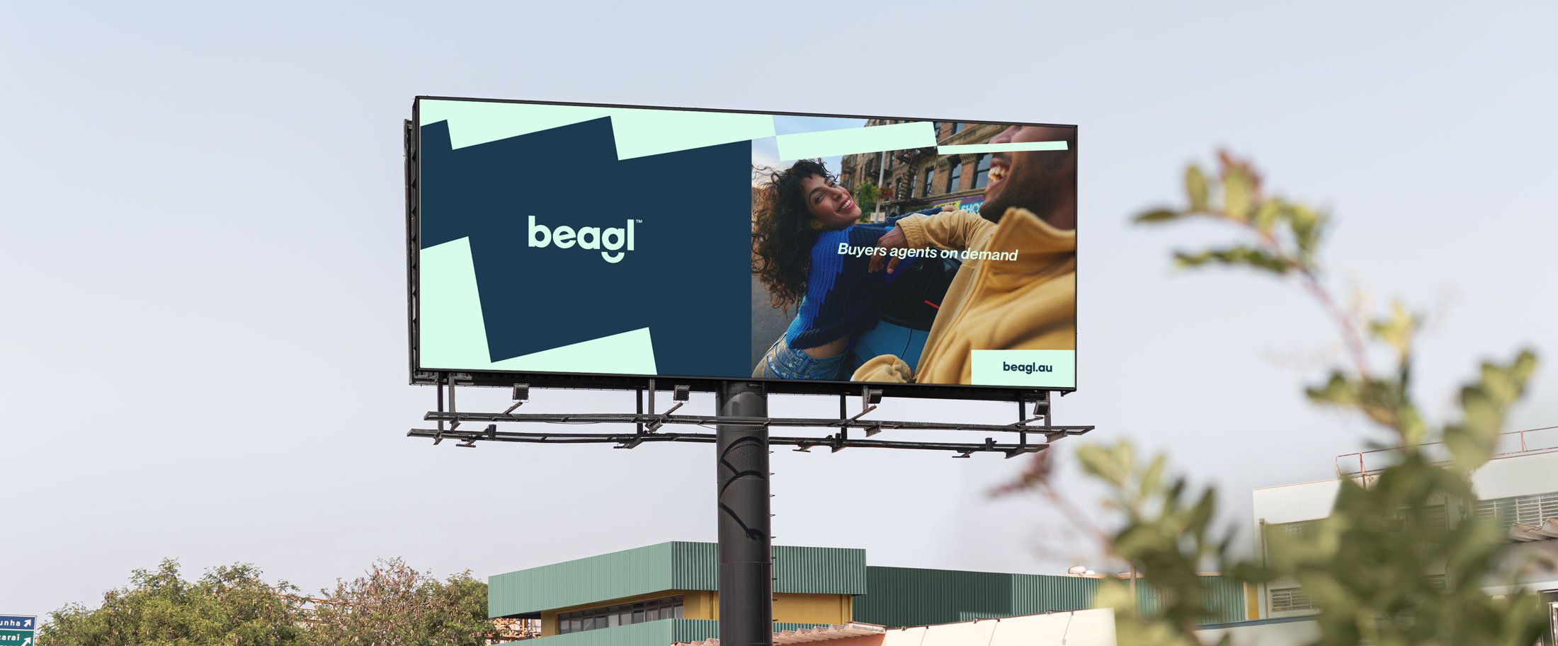
BEAGL
Naming, Brand Identity, Creative direction, Strategy
[2025]
Introducing Beagl — buyers agents, on your behalf. Positioned at the intersection of property and advocacy, Beagl signals a fresh approach to real estate: grounded in clarity, trust, and approachability.
Studiothinktank was engaged from the outset, leading the strategic and creative development of the name, identity, and launch framework for a startup intent on rethinking the category. With no legacy to draw from, the brand needed to feel confident from day one—credible yet youthful, professional but never remote.
The identity system was designed to be modular, allowing information to move fluidly across formats while maintaining a strong visual rhythm. Colour, typography, and layout were finely tuned to strike a precise balance—clear, charming, and unmistakably human.
In a market often defined by jargon and formality, Beagl brings a tone of voice that is both intelligent and inviting. From strategy through to rollout, Studiothinktank shaped a brand that communicates with personality and purpose—built to evolve well beyond its launch and into a fast-moving, competitive space.
LALA
A Visionary Identity for Perth’s New Open-Air Music Festival
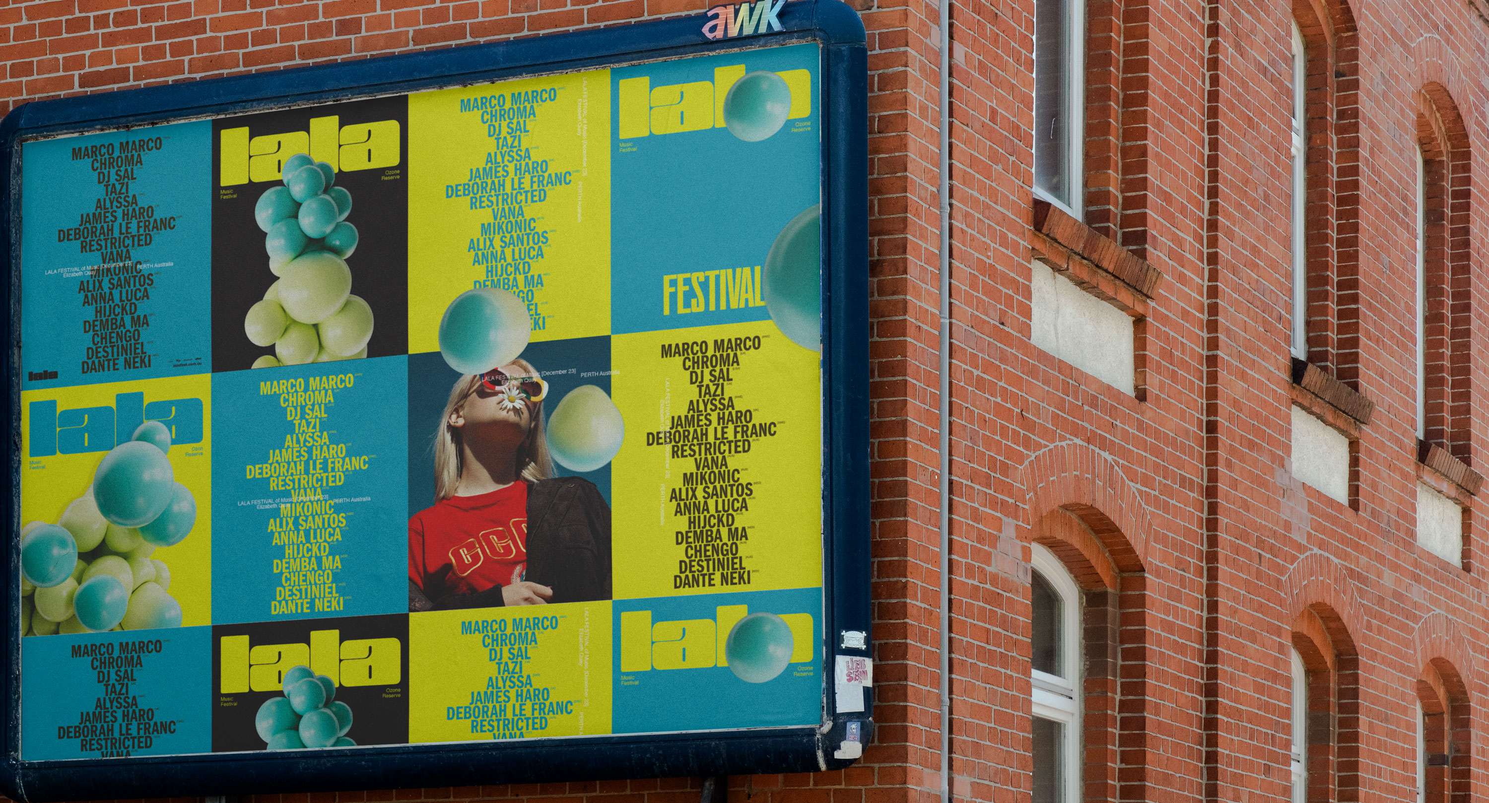

LALA Open Air Festival [2023]
Creative Direction, Design, Identity, Campaign
Launching a new open-air music festival in Perth presented a unique challenge: establishing a compelling brand presence in a saturated market without the support of pre-existing assets or past event visuals. The identity and year-one campaign required a thoughtful approach—one that would captivate audiences and create a cohesive visual narrative from the ground up.
A meticulously designed motion graphics suite became the cornerstone of the festival’s brand identity. This system ensured a unified voice across all touchpoints, maintaining consistency while allowing the supporting visuals to take center stage. The result was an identity that could stand independently, minimizing reliance on repetitive logotype placement and instead leaning into dynamic, recognizable brand elements.
Music festivals, by nature, operate within long marketing timelines, creating the risk of messaging fatigue over time. To counteract this, the identity system incorporated flexible, highly stylized design elements that sustained visual interest throughout the campaign. This approach ensured the brand remained dynamic and engaging from announcement through to the event’s culmination.
Entering the competitive festival market for the first time, the visual identity had to immediately capture attention and convey credibility. The campaign emphasized bold, memorable design to make a striking first impression, compensating for the absence of archival footage or photography.
The final result was a visually immersive and highly adaptable identity that amplified the festival’s presence across both digital and physical platforms, setting the stage for its inaugural year and beyond.
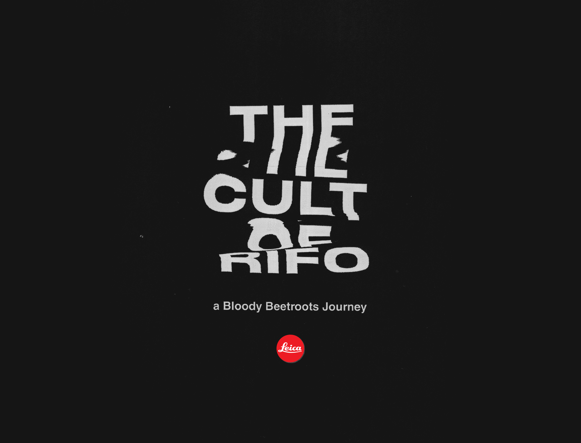
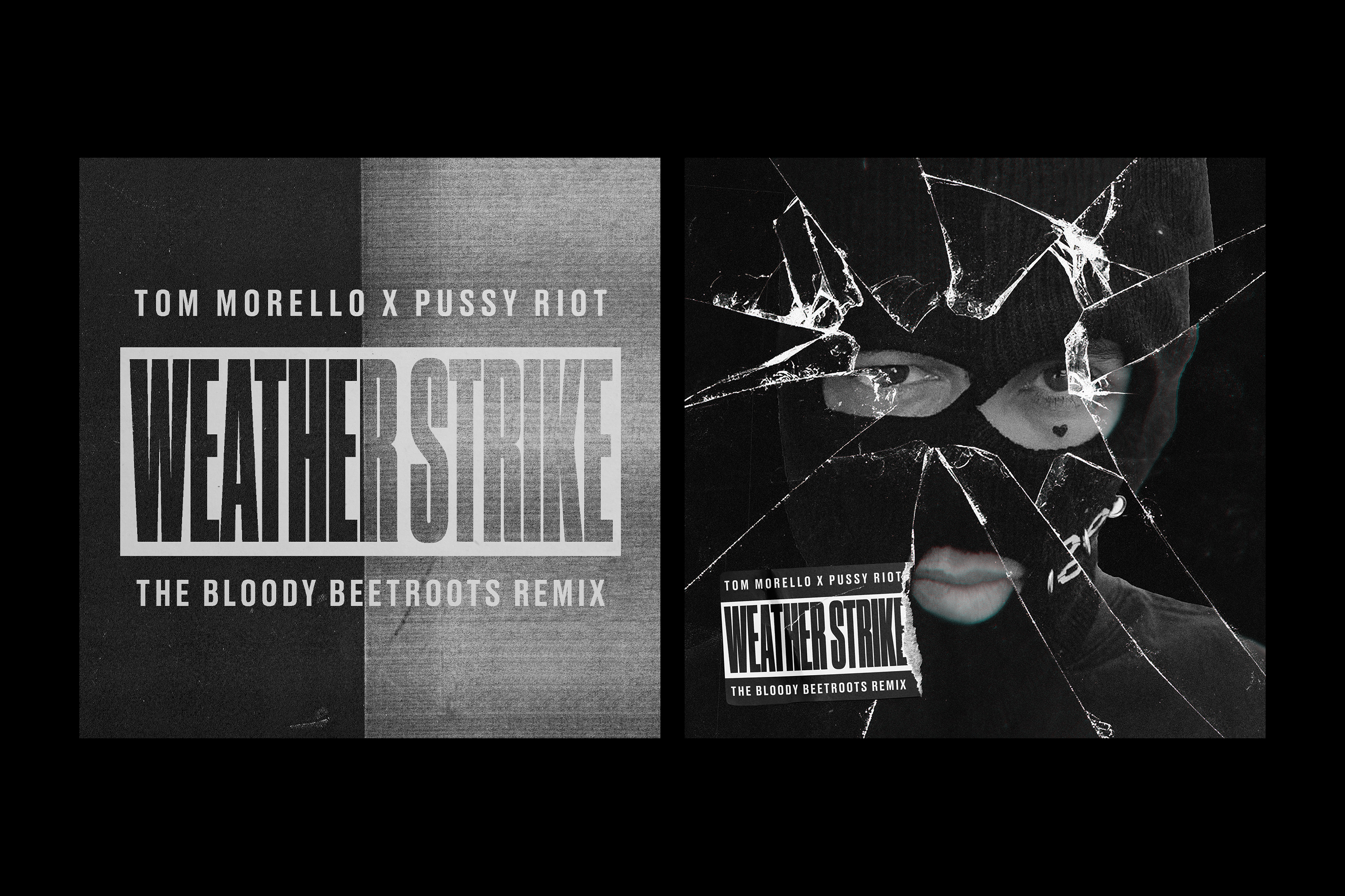
The Catastrophists EP
Identity and Design for Tom Morello and
The Bloody Beetroots collaborative album
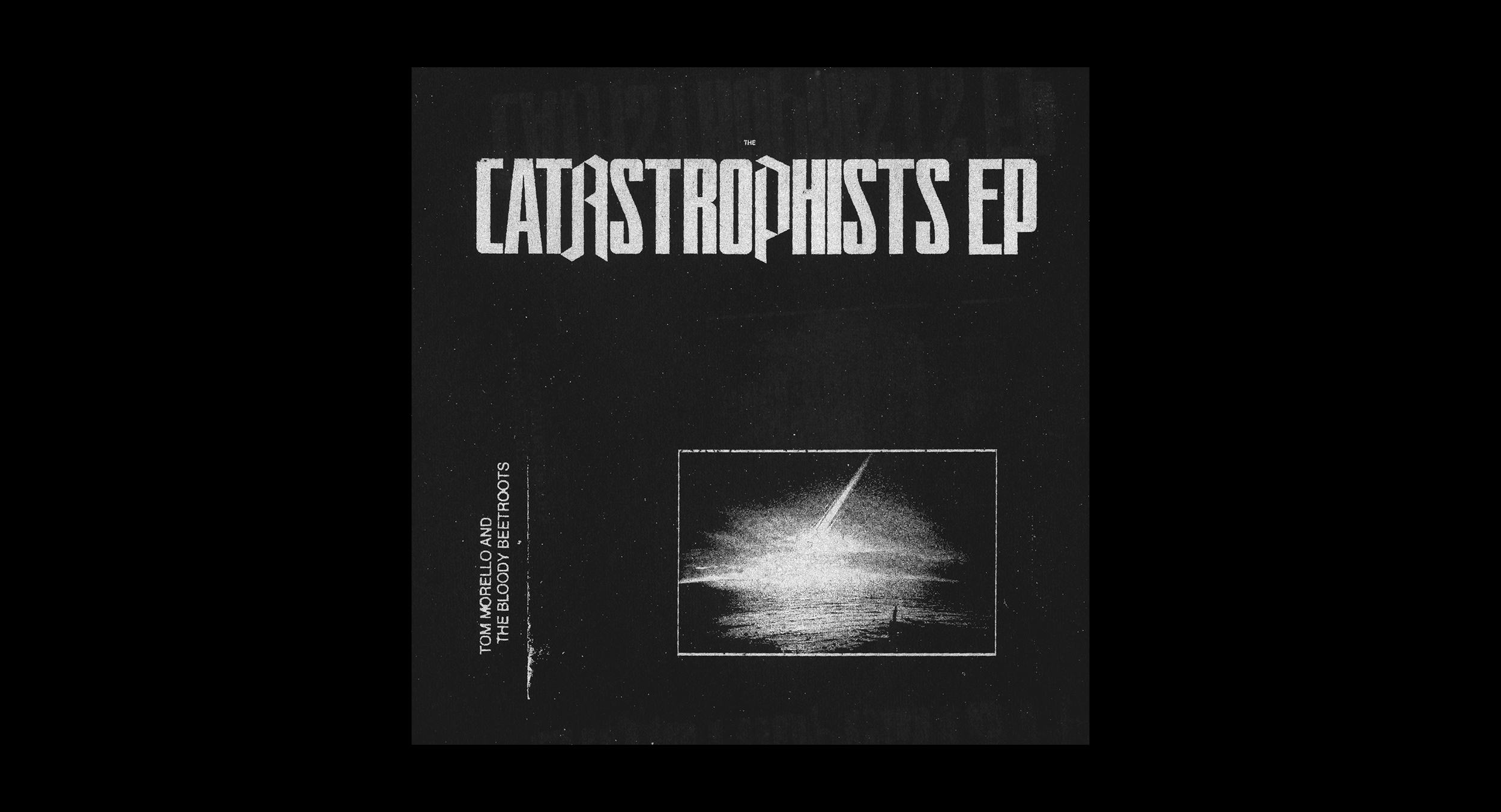

TOM MORELLO & THE BLOODY BEETROOTS
THE CATASTROPHISTS EP (2021)
Commandante Records
Creative Direction, Design, Identity
StudioThinktank - Identity, Direction, Design
THE CATASTROPHISTS EP (2021)
Commandante Records
Creative Direction, Design, Identity
StudioThinktank - Identity, Direction, Design
BAGELO’S DELICATESSEN
Creative Direction, Identity
Project presentation coming shortly...
Creative Direction, Identity
Project presentation coming shortly...
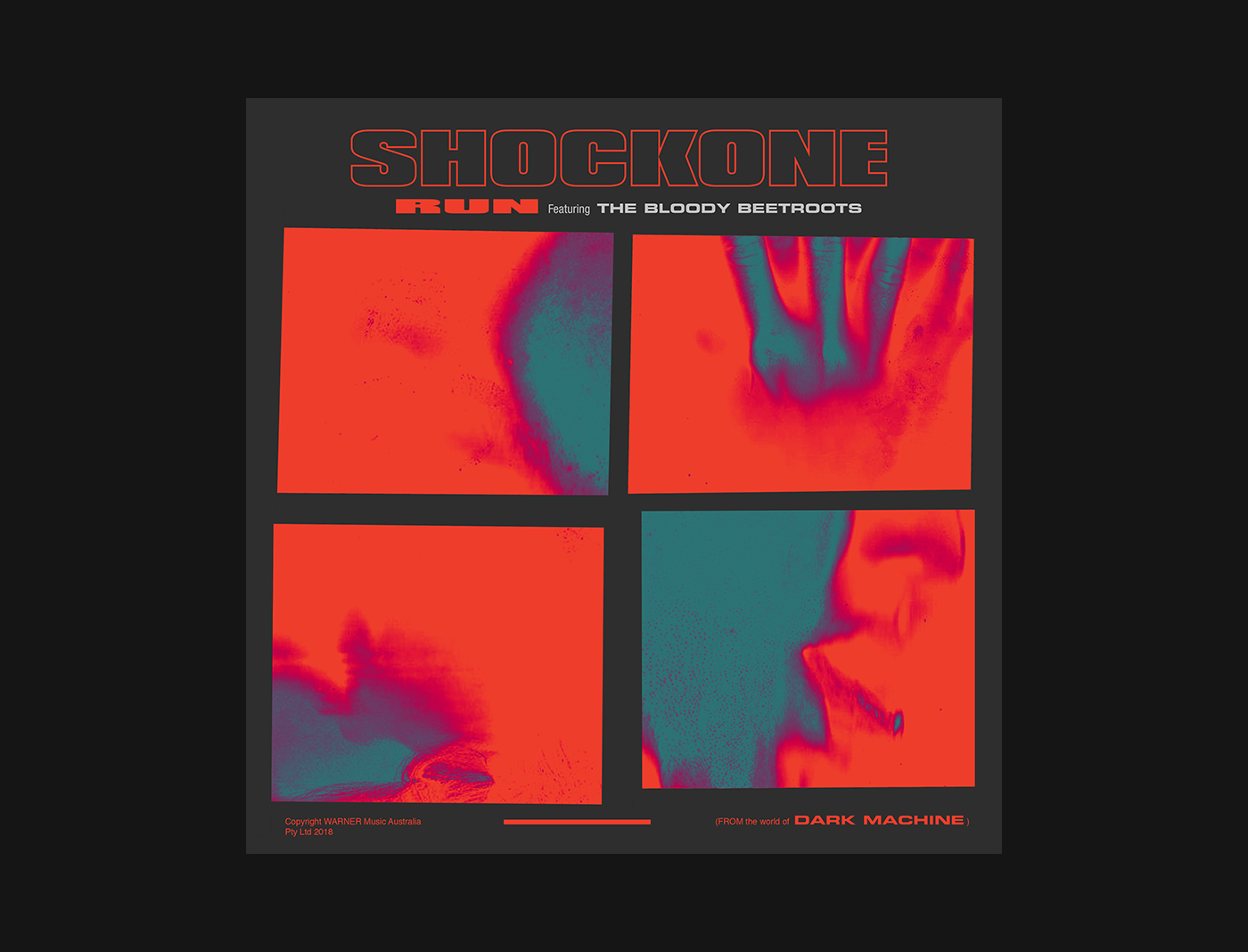
Shockone
A Dark Machine album release creative
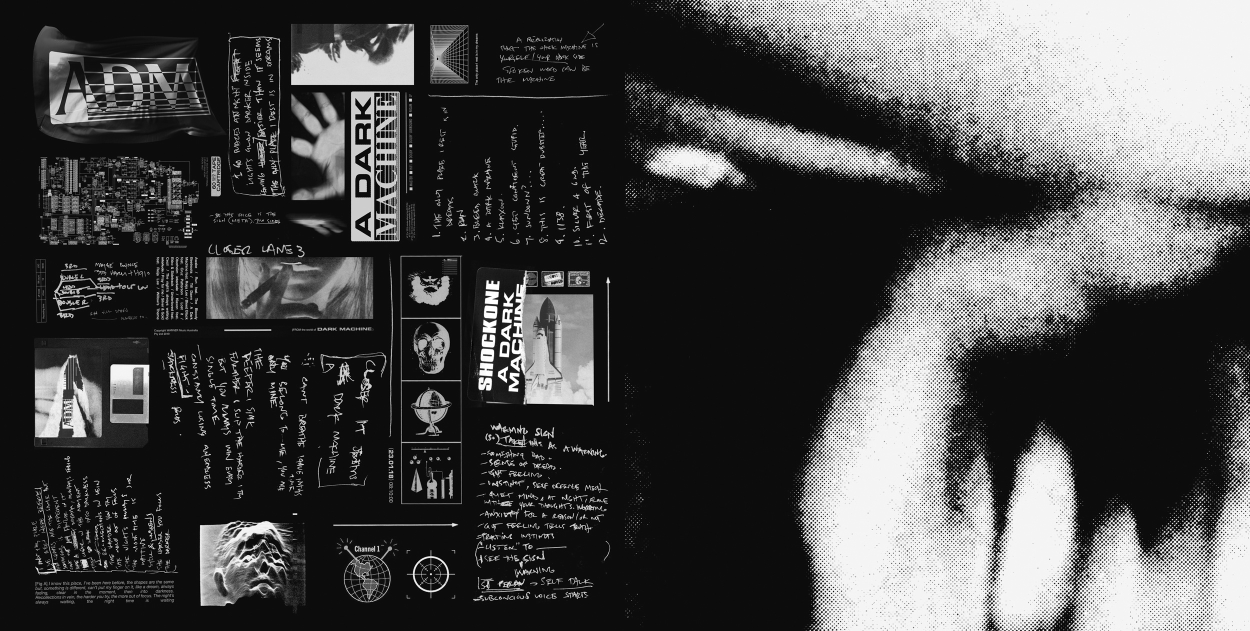


SHOCKONE
A DARK MACHINE (2018)
Warner Music Australia
Creative Direction, Design, Identity
StudioThinktank and Karl worked closely together throughout this album process, discussing ideas rather than aesthetics, creating a visual identity to the world he had created through the music. The cover art is the encapsulation of this world, a physical artefact of digital technology and its ability to suffocate everything it surrounds.
This record is a telling of the times, not literally, but in the pushing and pulling of the emotional landscape, the joy and the anxiety, the 0s and the 1s, it was important to find a way to capture this digitisation in the physical realm, and label it for what it ultimately is. A Dark Machine.
The packaging for this record was made out of completely physical materials, scanned and laid out to create the front and rear cover.
StudioThinktank - Identity, Direction, Design
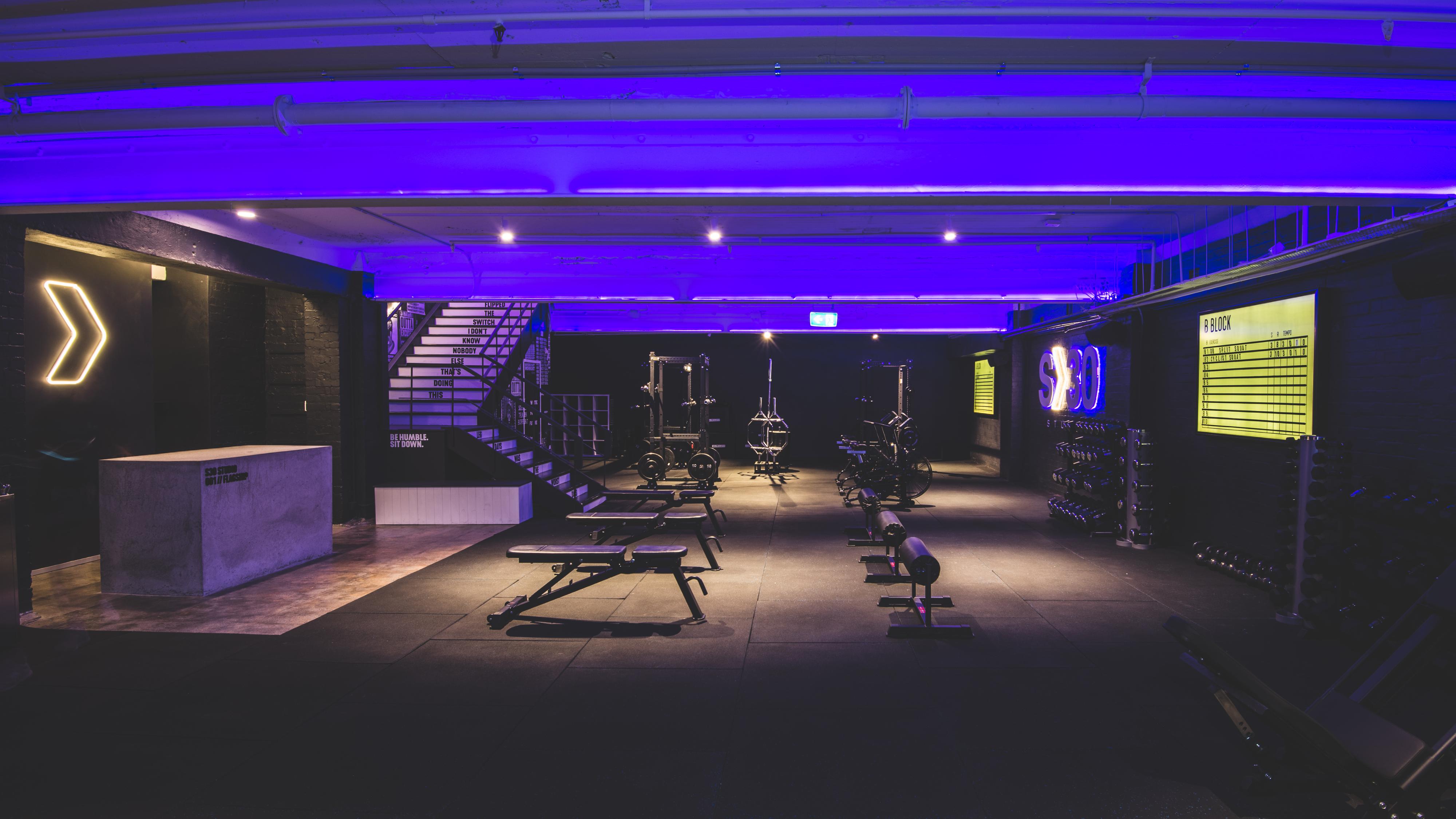
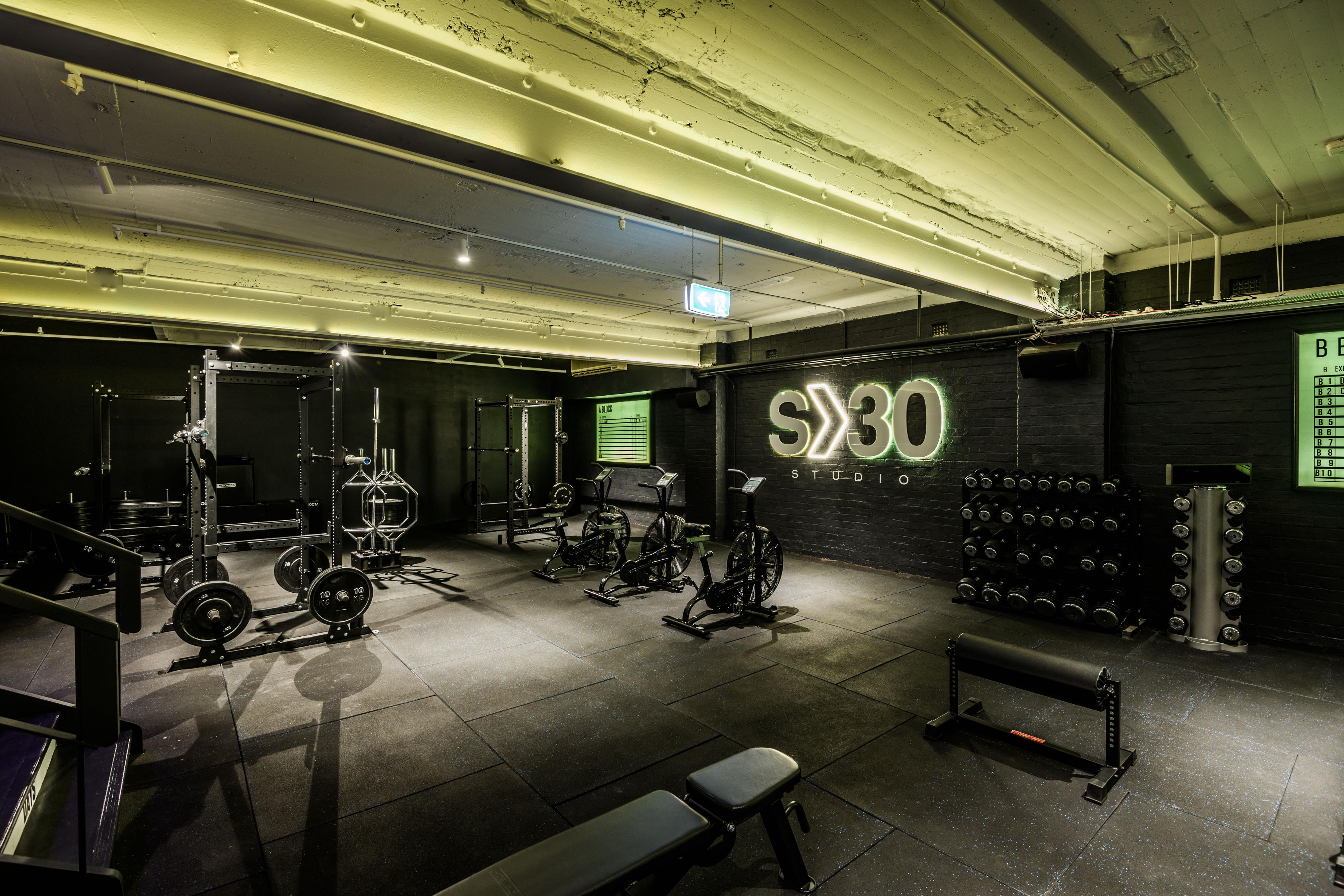
Set30 Studio
Creating an identity for Australias nightclub
inspired group training studios
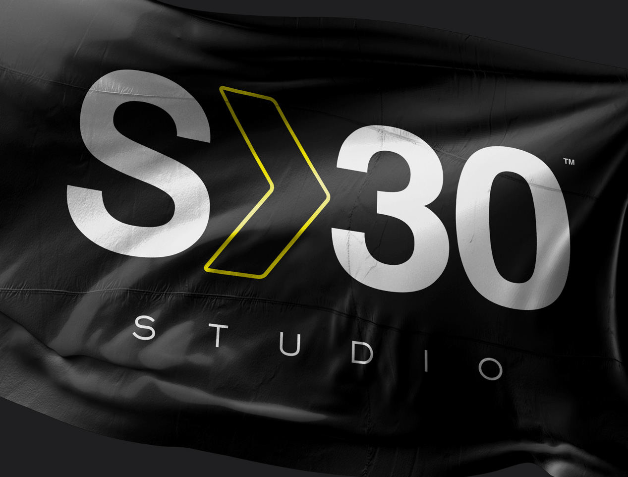

SET30 STUDIO
Creative Direction, Identity
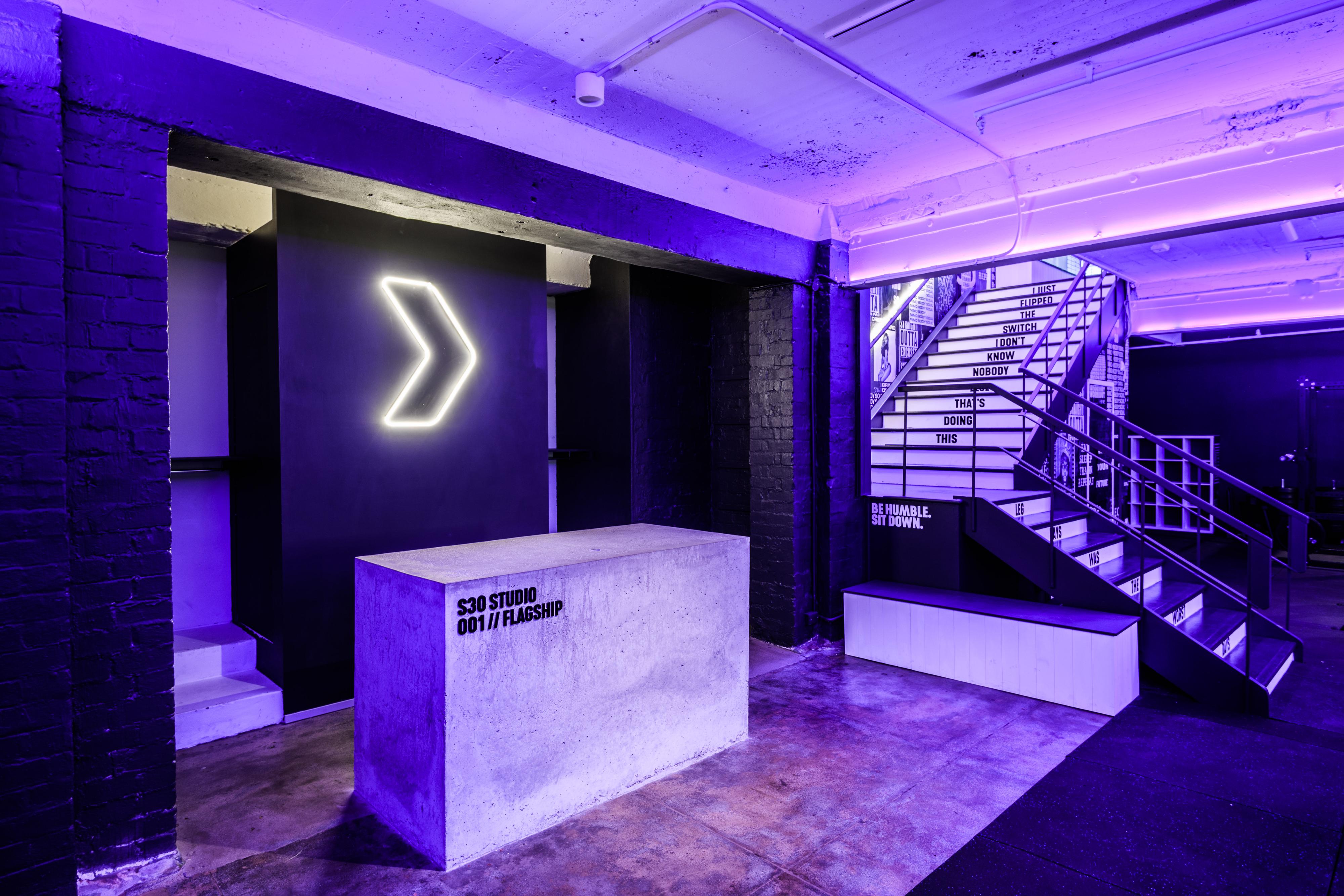
Set30 approached StudioThinktank to create a scalable brand identity system for a company focussed on reimagining the fitness industry, with intense focus on community, music and eliminating the stigma of gyms.
The project had to consider 3 key elements; The branding and company ideals must be fully expressed in the flagship studio space, a basement in central Perth, Australia. The core branding must be able to be utilised throughout marketing collateral and future physical locations. The branding must encompass a fitness brand, not just a gym, allowing future expansion through apparel and equipment.
StudioThinktank worked collaboratively with interior architect Alex Carter from Harlow + Willow to bring the space to life with LED strip lighting, industrial concrete and muted tones and Neon Flex detailing.
Creative Direction, Identity
Set30 approached StudioThinktank to create a scalable brand identity system for a company focussed on reimagining the fitness industry, with intense focus on community, music and eliminating the stigma of gyms.
The project had to consider 3 key elements; The branding and company ideals must be fully expressed in the flagship studio space, a basement in central Perth, Australia. The core branding must be able to be utilised throughout marketing collateral and future physical locations. The branding must encompass a fitness brand, not just a gym, allowing future expansion through apparel and equipment.
StudioThinktank worked collaboratively with interior architect Alex Carter from Harlow + Willow to bring the space to life with LED strip lighting, industrial concrete and muted tones and Neon Flex detailing.
Simplicity was key with the identity for S30, creating an icon that works alongside the logotype, that will eventually act as the hero graphic for the brand.
The yellow penlined arrow is based upon the idea of S30 being a vehicle in which to move forward in fitness. A call to the customer to put themselves in the arrow and progress toward the fitness lifestyle that they desire.
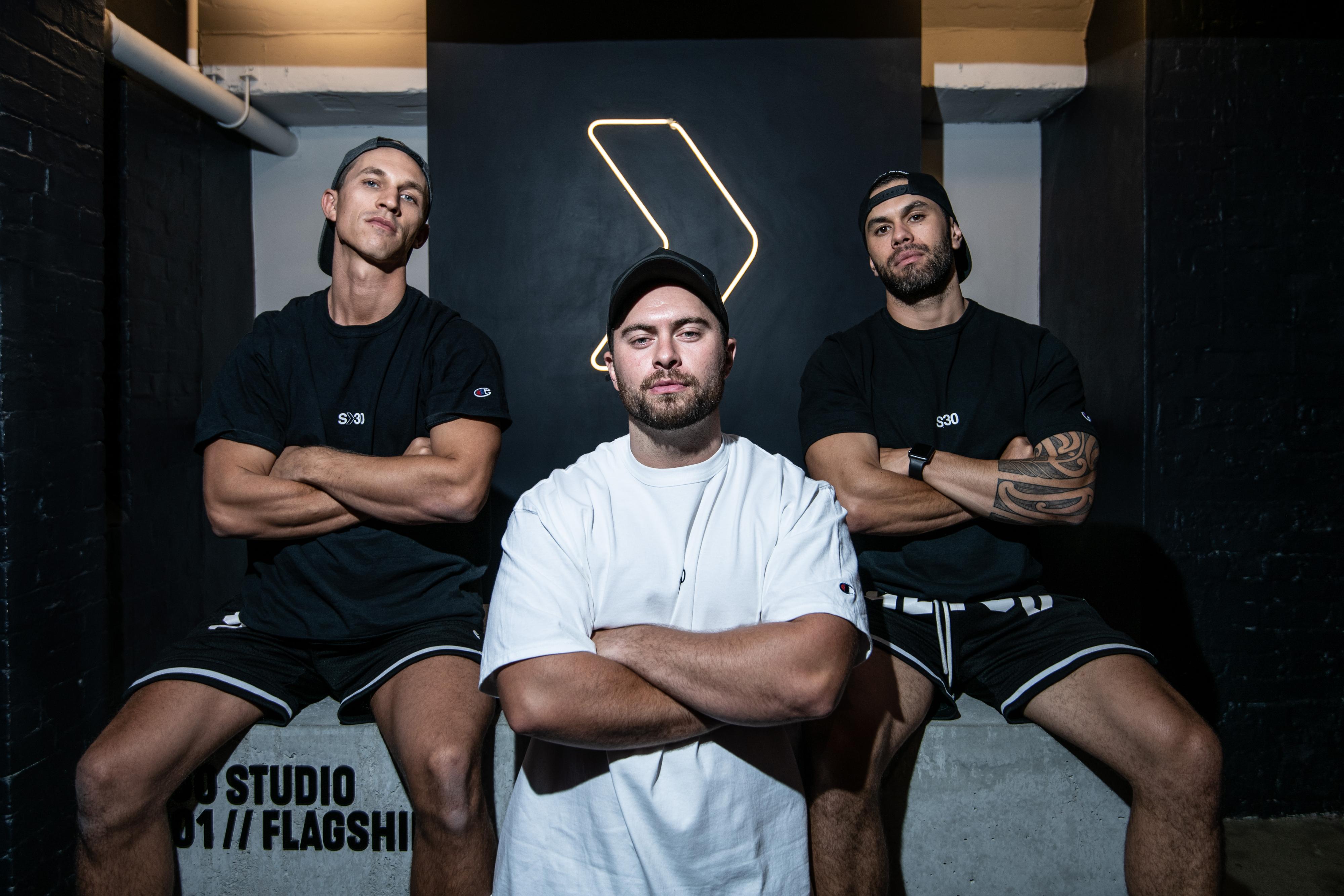
StudioThinktank - Creative Direction, Identity, Design
Harlow & Willow - Interior Design
Oscar Ozo - Lighting Design
DGPR - Public Relations
The yellow penlined arrow is based upon the idea of S30 being a vehicle in which to move forward in fitness. A call to the customer to put themselves in the arrow and progress toward the fitness lifestyle that they desire.
StudioThinktank - Creative Direction, Identity, Design
Harlow & Willow - Interior Design
Oscar Ozo - Lighting Design
DGPR - Public Relations


VARIOUS
Design, Identity, Direction
2017 - Current
Design, Identity, Direction
2017 - Current
..
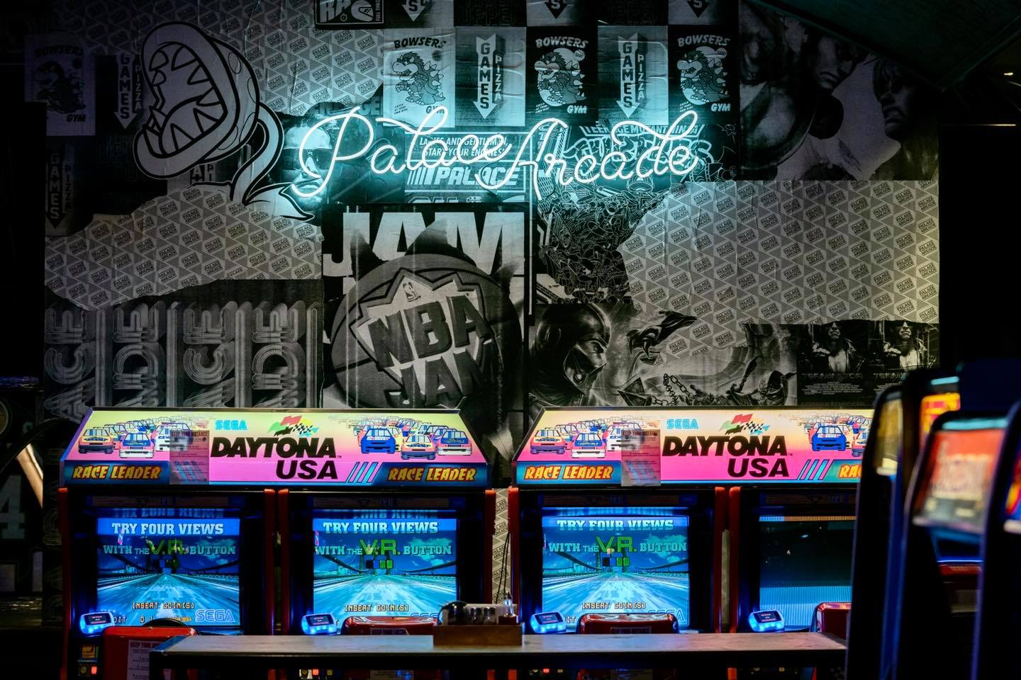
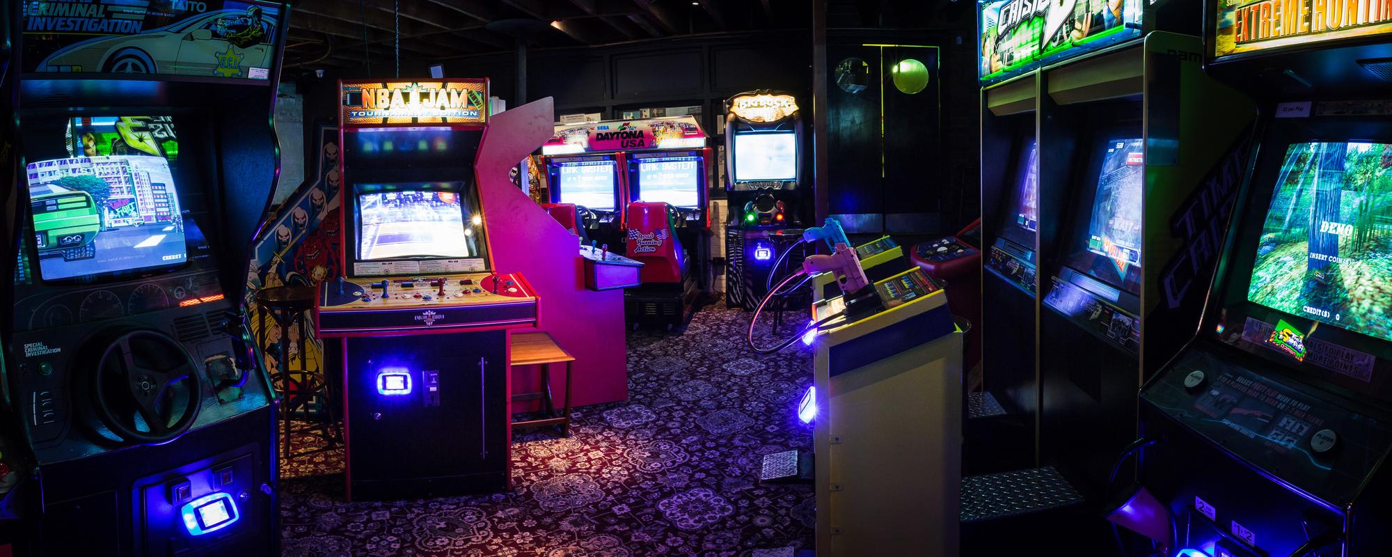
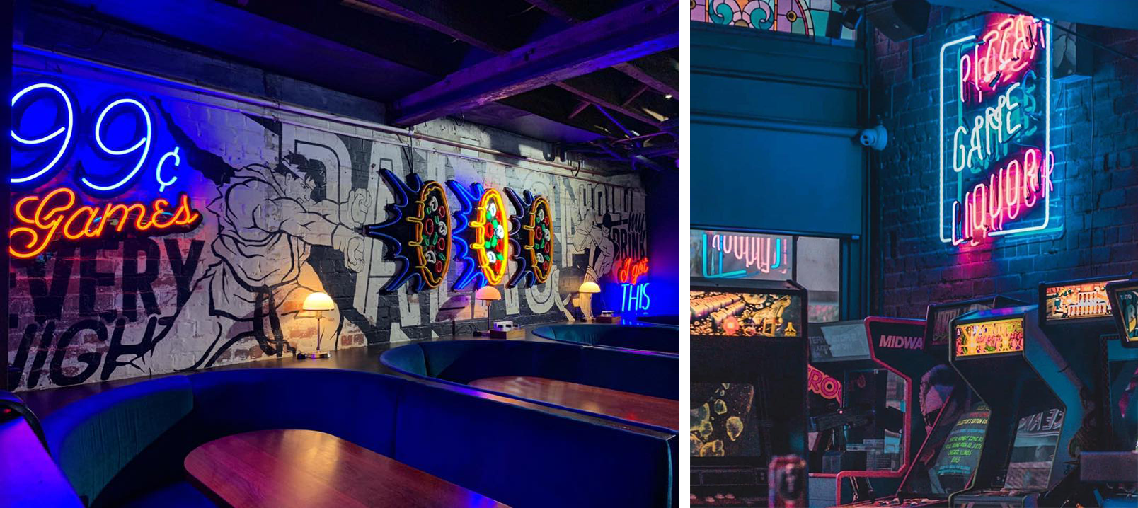
Palace Arcade
A neon inspired identity for Western Australias first barcade chain
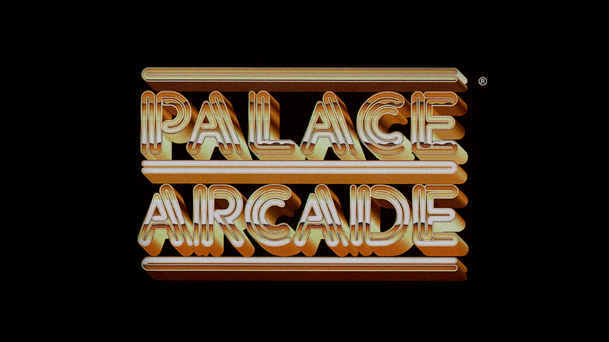
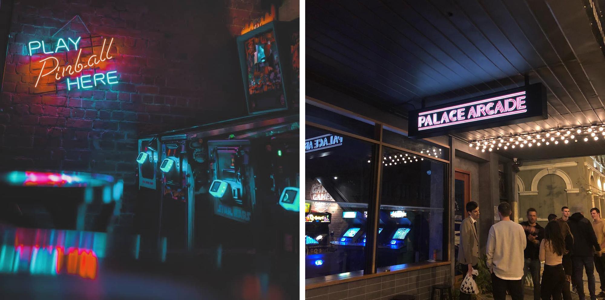
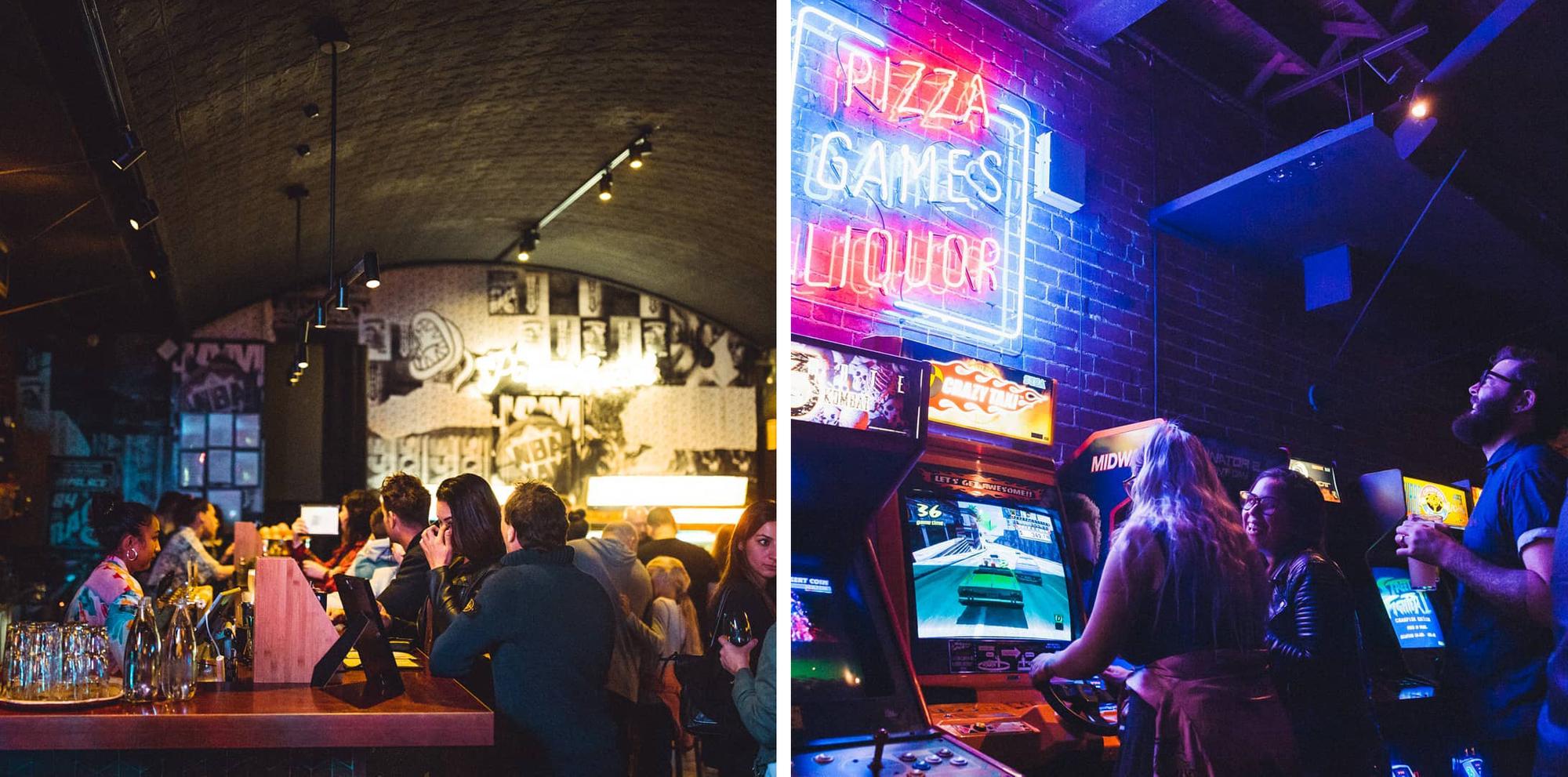
PALACE ARCADE
Identity, Design, Fitout
2018
Palace Arcade approached StudioThinktank to create a scalable brand identity system for a series of Arcade style bars.
We worked closely with the owners to bring the idea to life, creating a bold 1980s inspired logotype.
StudioThinktank® worked on the vision for the interior of the flagship bar, located on Perths busy Beaufort Street designing a 10 foot high monotype poster wall at the rear of the venue, hand painted branding elements throughout and an intricate feature wall in the basement.
The basement feature wall features iconic arcade game characters embroiled in pizza combat, with a series of neon flex signs creating motion along the wall in the form of light and colour. The venue opened to rave reviews and has had national television coverage throughout Australia for its brilliant concept and execution.
StudioThinktank - Creative Direction, Design
Michael Hartley - Illustration
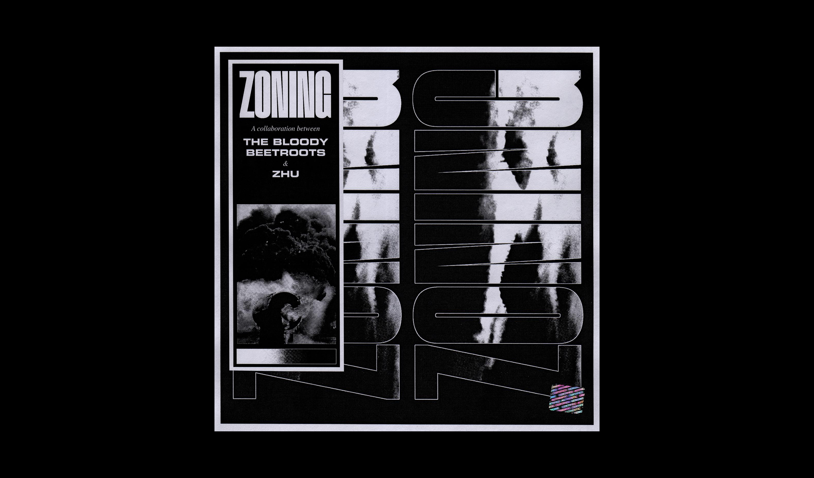

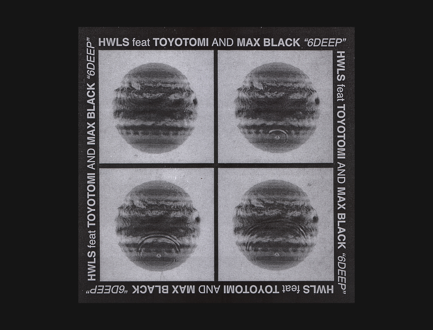
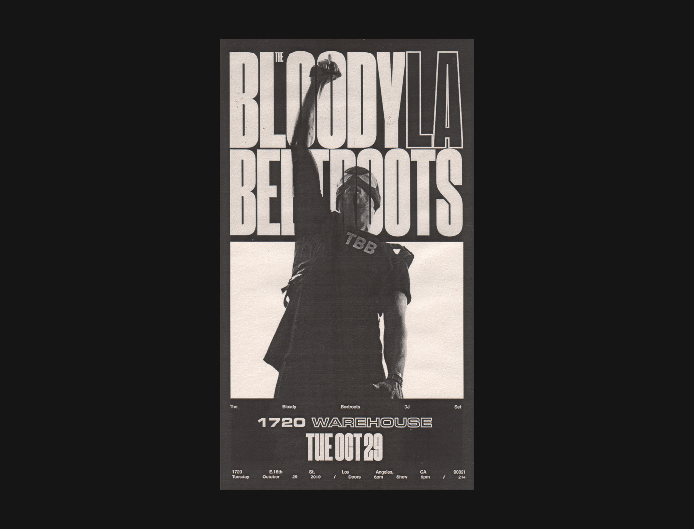
ZHU & THE BLOODY BEETROOTS
Single Release, 2019
StudioThinktank was comissioned by The Bloody Beetroots to create the single artwork for their song Zoning with ZHU.
Maintaining the monotone aesthetic that the band is famous for, we created a gritty aesthetic anchored in motion and the idea of creation and destruction.
StudioThinkTank, Concept & Design
..
YeSports
brand identity and creative direction for the
fastest growing Web3 Esports platform on earth

NFT Projects
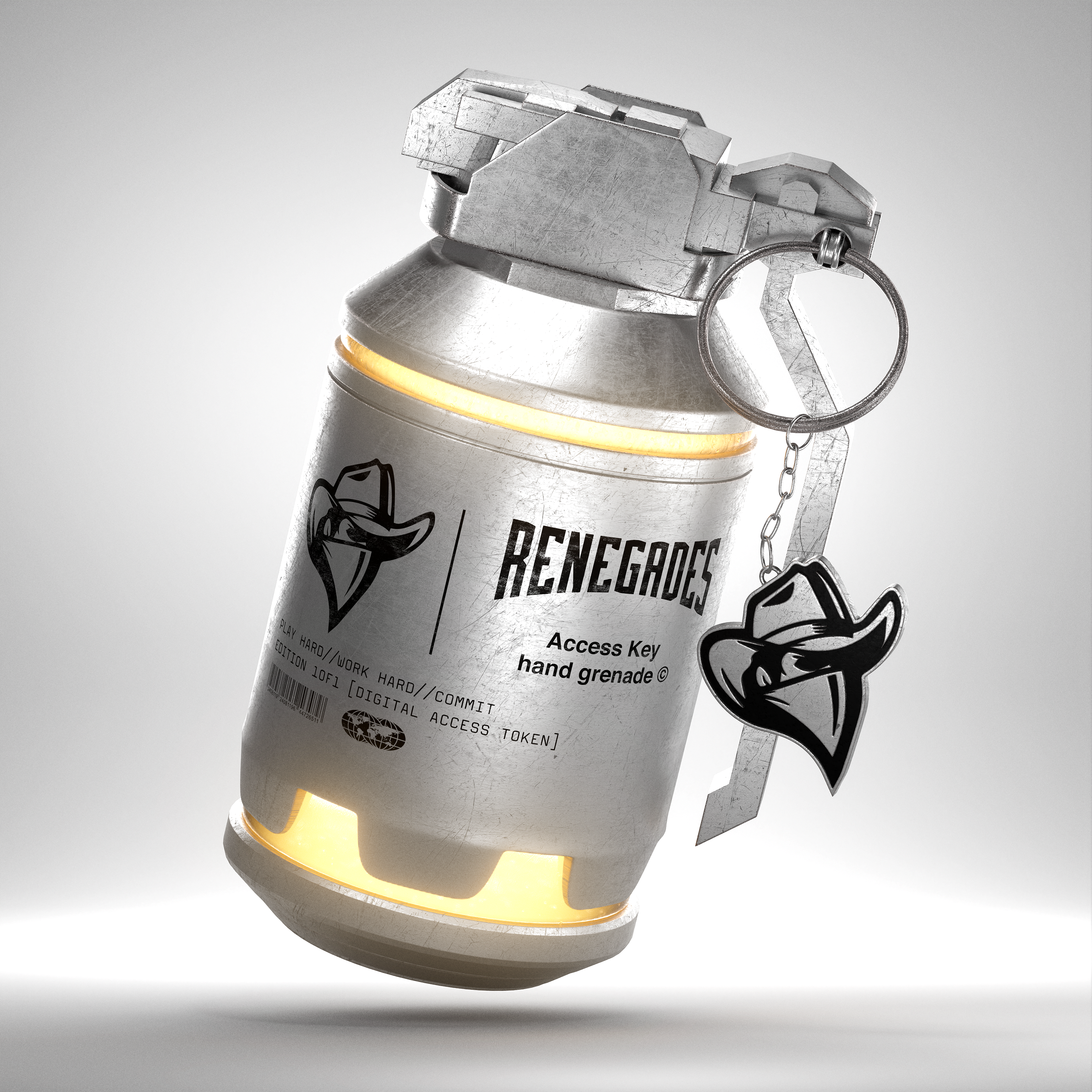


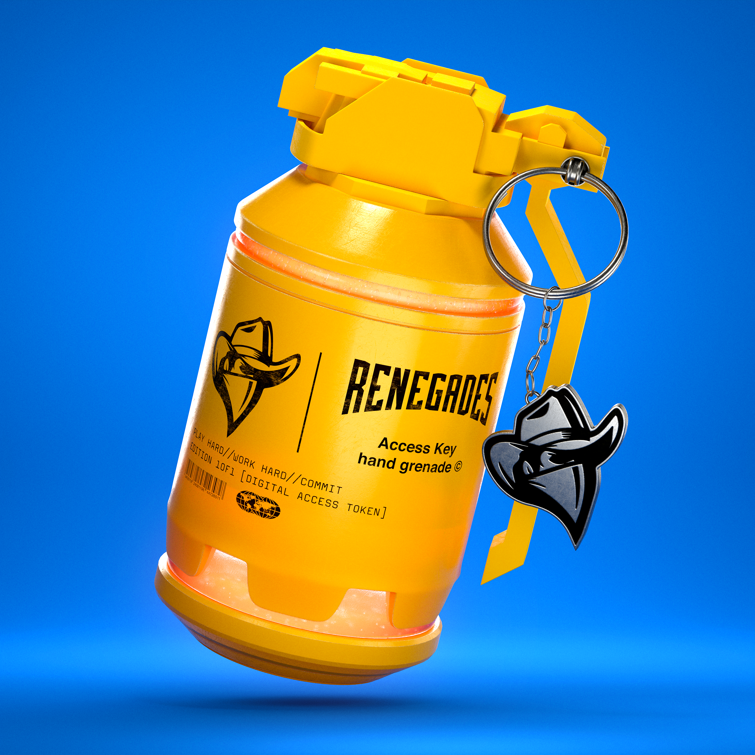


RENEGADES
Generative NFT Collection
Generative NFT Collection


BOOM Esports
Generative NFT Collection
Generative NFT Collection
Shockone, Follow Me
Digital narcissistic candy visuals for a dystopian anthem

SHOCKONE
FOLLOW ME (2019)
DMR Records / UKF
Art Direction, Design, Motion
Cover art and motion graphics for single release. The concept is derived from the love heart candy of the 80’s being relayed in digital form, with dystopian quotes related to the narcasistic nature of the social media generation.
StudioThinktank - Art Direction, Design
Jacob Horan - 3D production
Shockone, Hardwired
Dancing bloodbags for the drum and
bass super producer
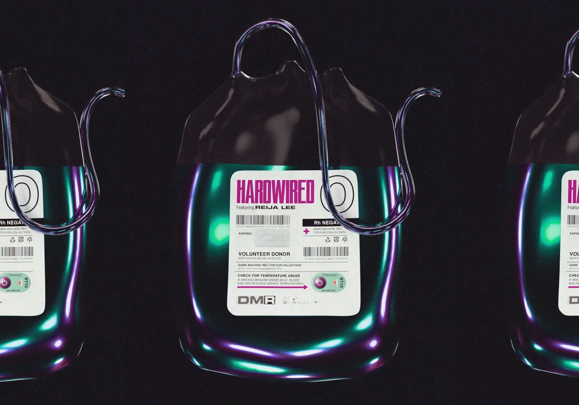
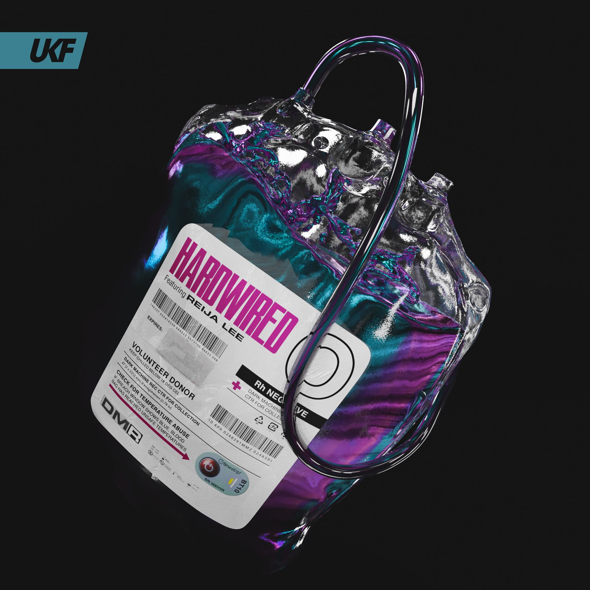
SHOCKONE
HARDWIRED (2021)
DMR Records / UKF
Creative Direction, Design, Motion
Single release artwork and motion graphics for the second single off the forthcoming Shockone album. A continuation of the aesthetic of Follow Me, using the transluscent material in liquid form to act as a digital intravenious transfusion. A number of different outputs were created as visuals for the single that were used across socials, streaming services and print marketing.
StudioThinktank - Creative Director, Design
Jacob Horan - 3D outputs
The Bloody Beetroots
A brand identity for multiple applications for
the iconic electronic artist
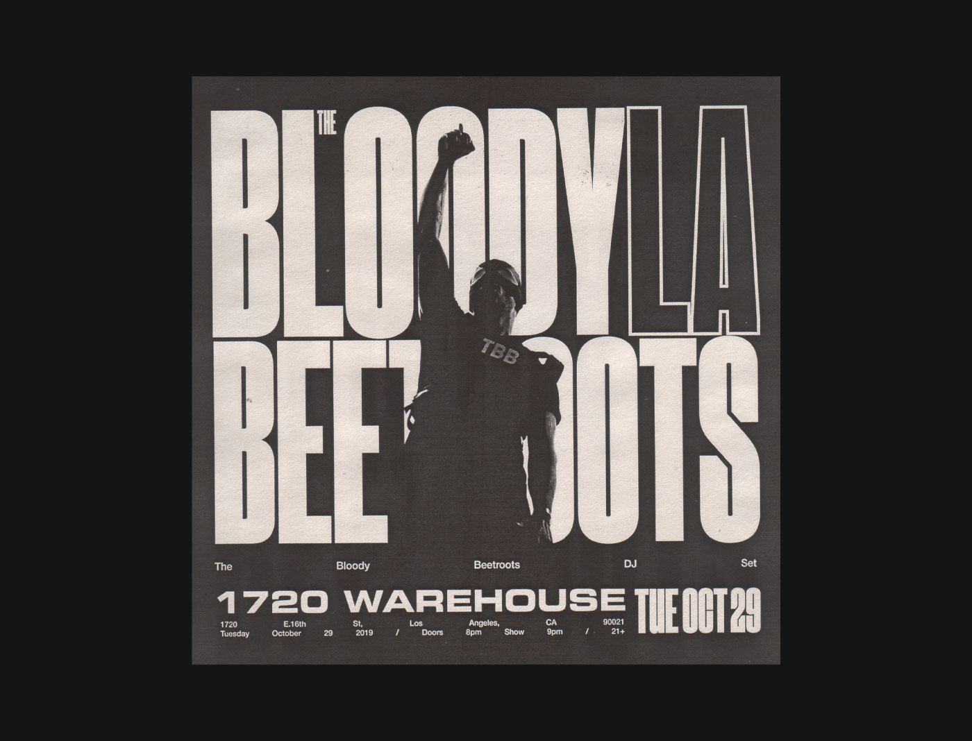
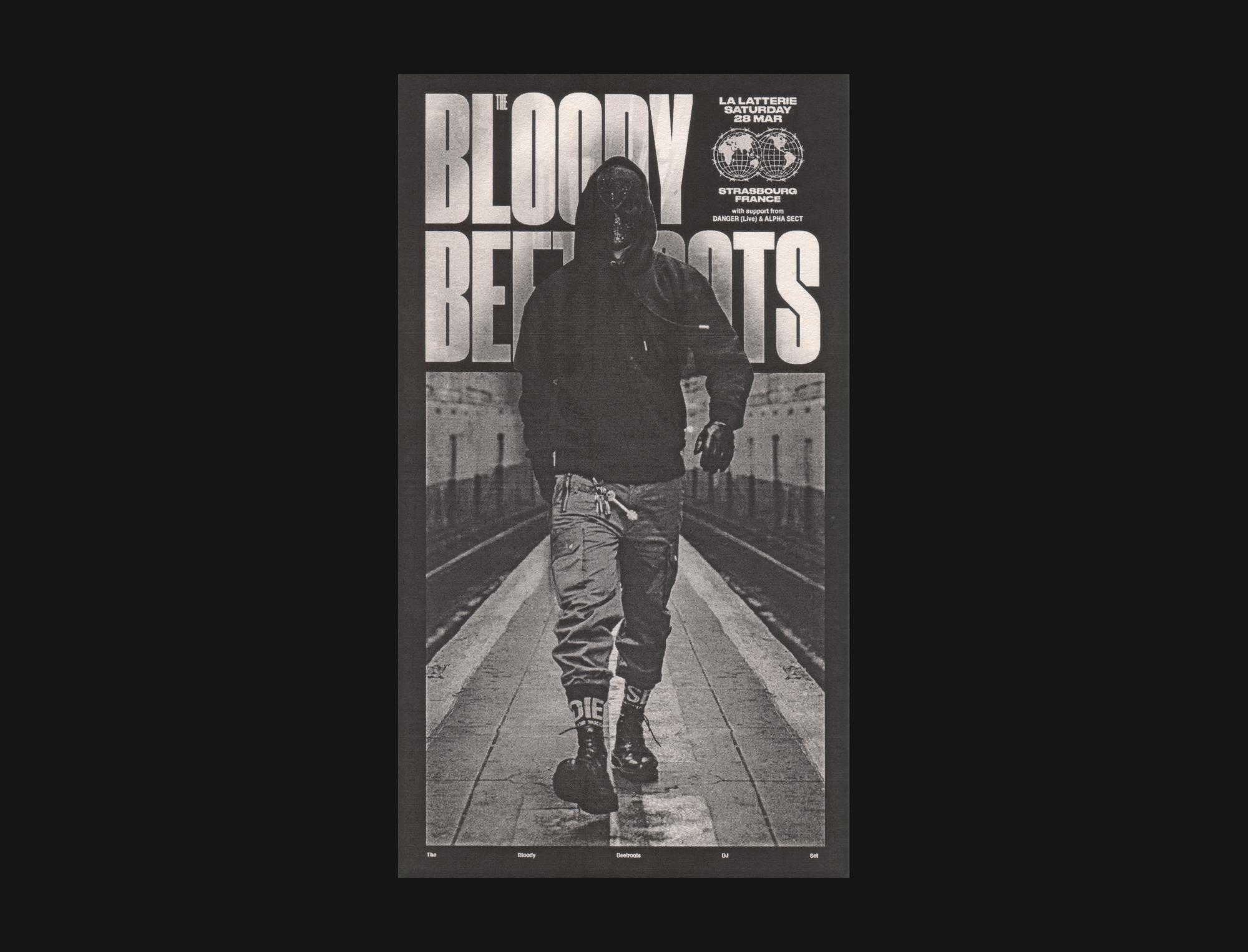
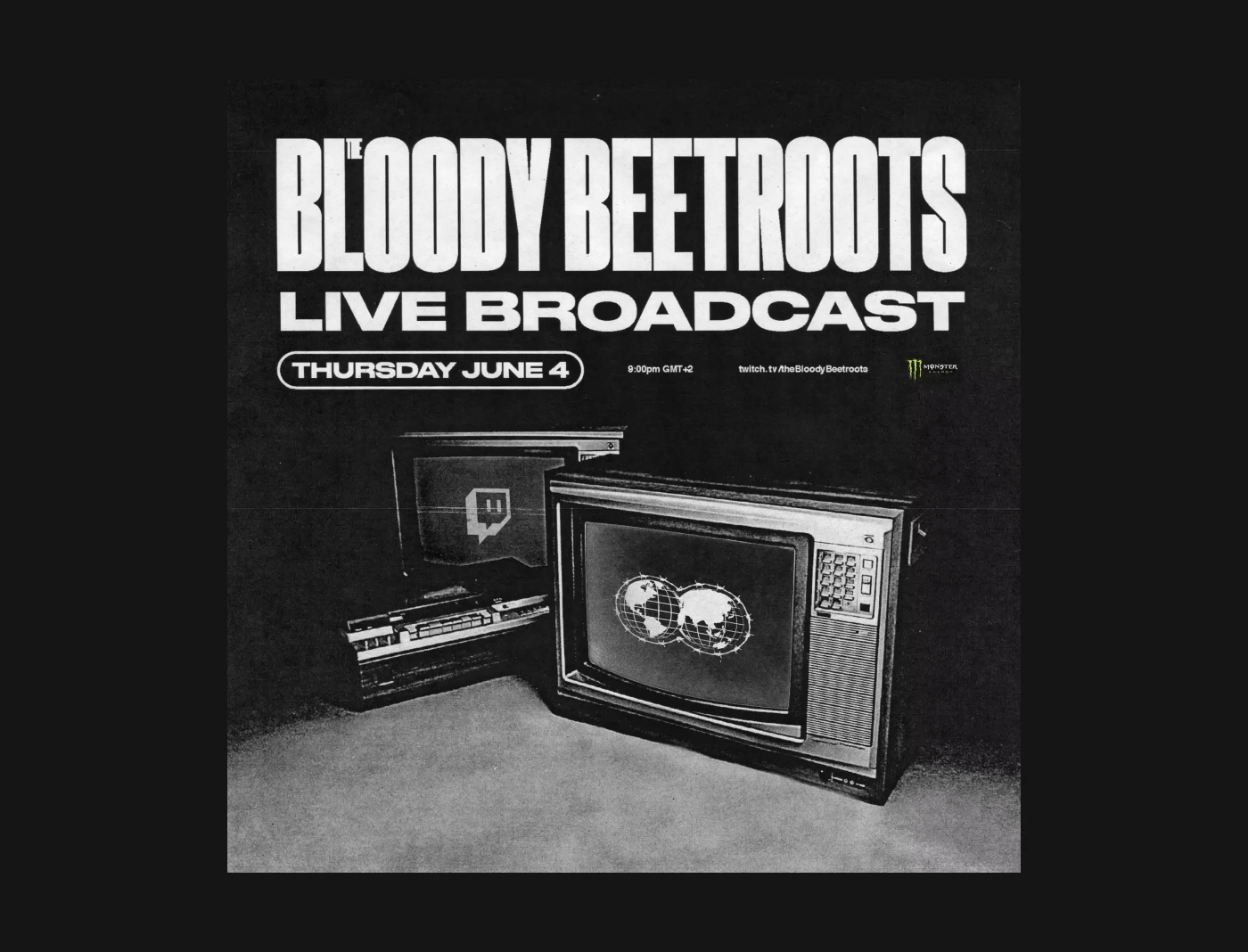
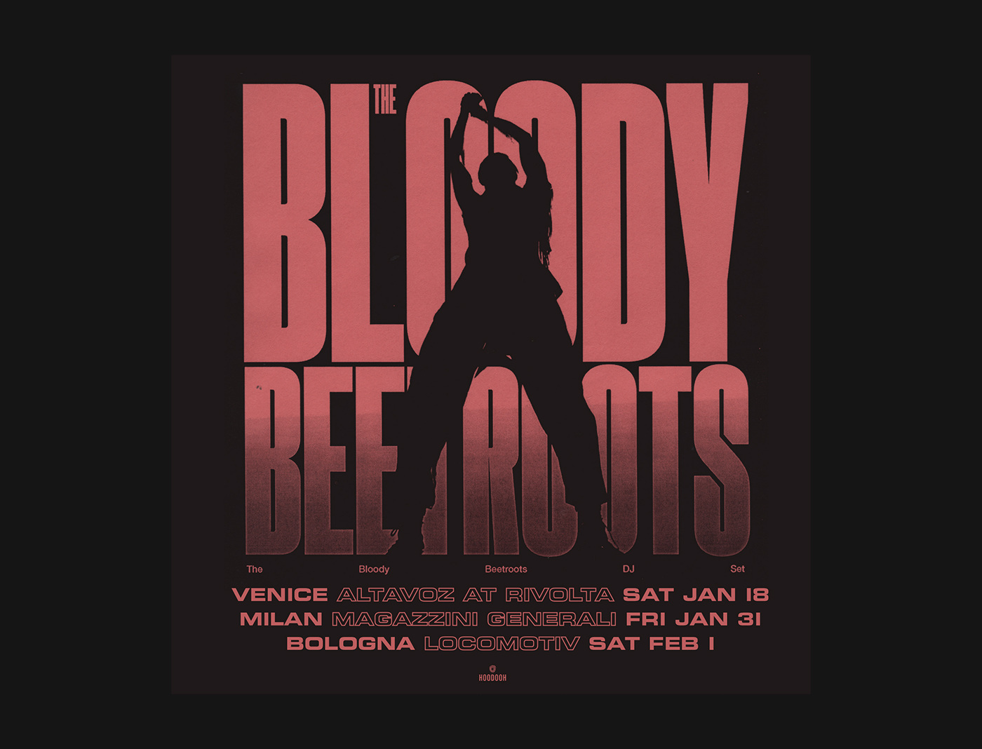
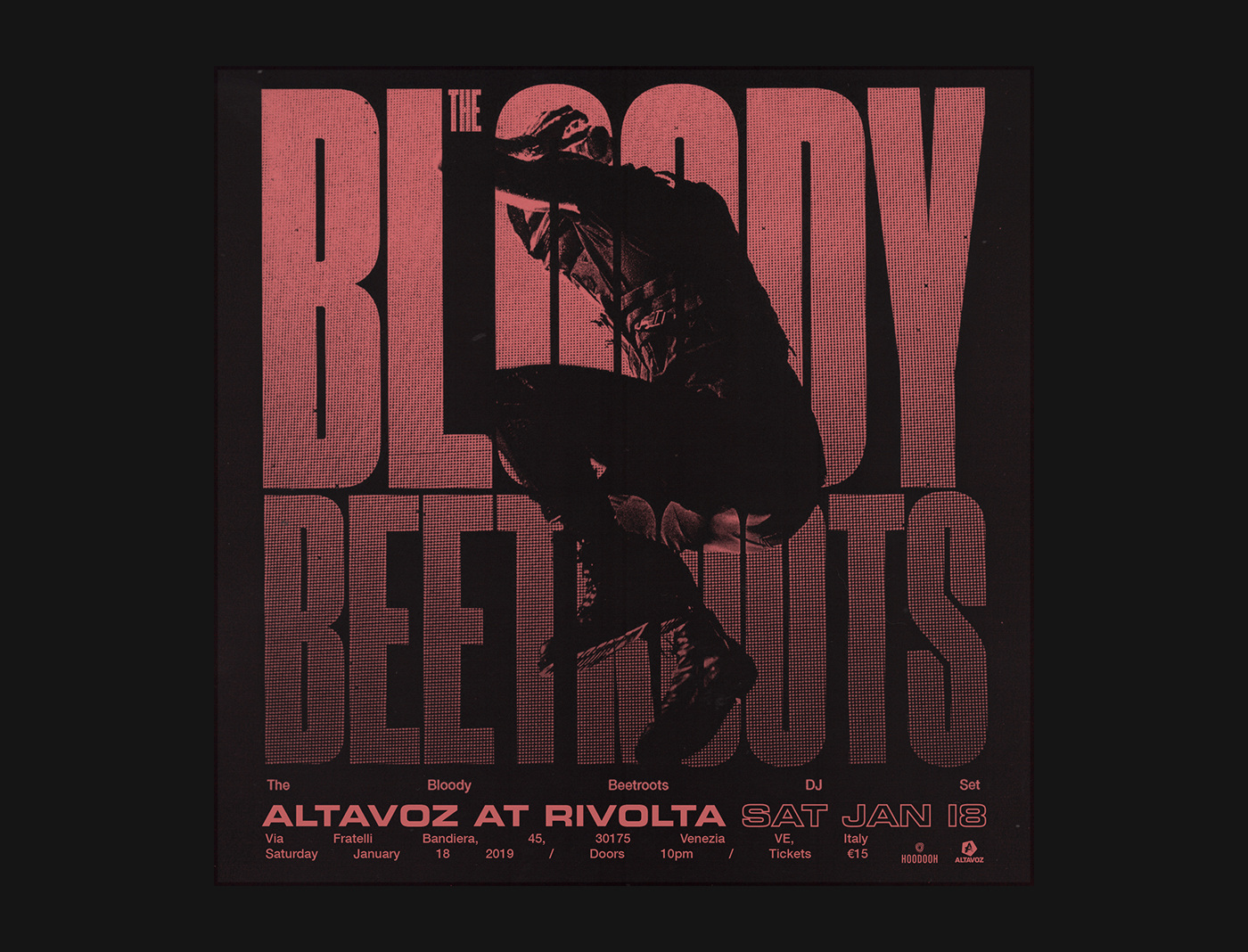
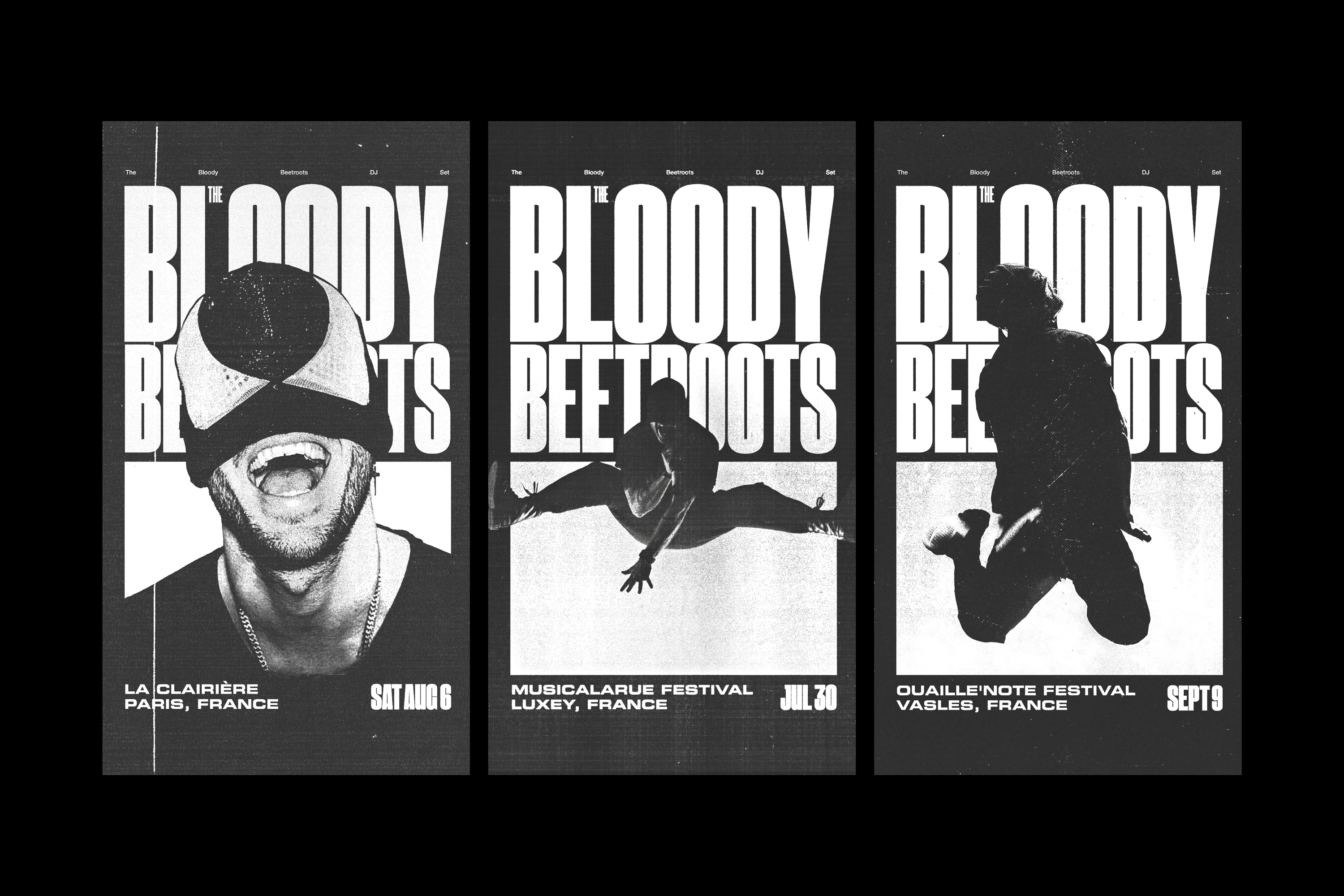
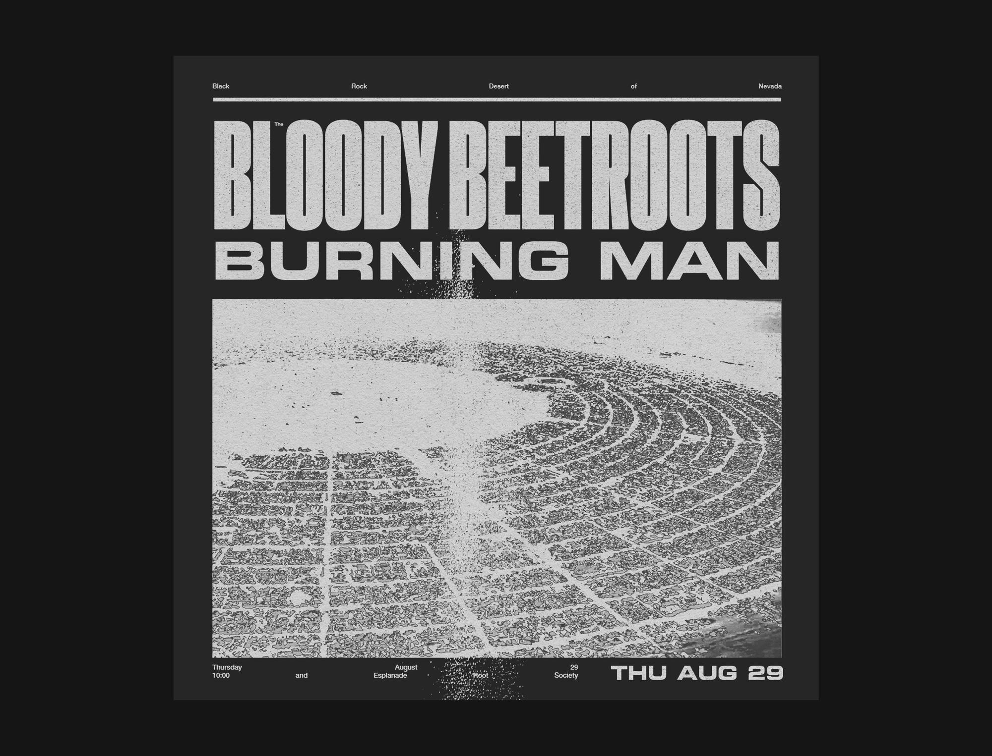
THE BLOODY BEETROOTS
Identity, Design
2020 onwards
An overarching identity design for the iconic Italian electronic punk artist. A bold and dark style that can work across a multitude of exectuions including tour art, live visuals and collaborative release collateral.
It was integral that the identity was stylised as to not get tired throughout an intense touring and release schedule. StudioThinktank created an aesthetic that has become synonymous with the artist.
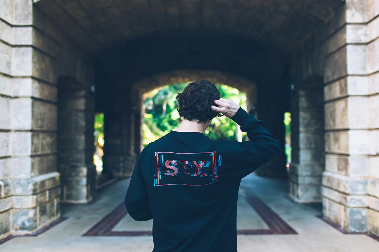
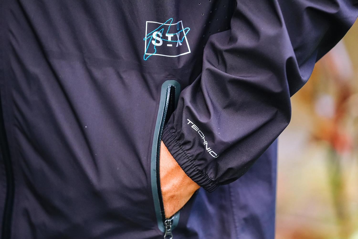
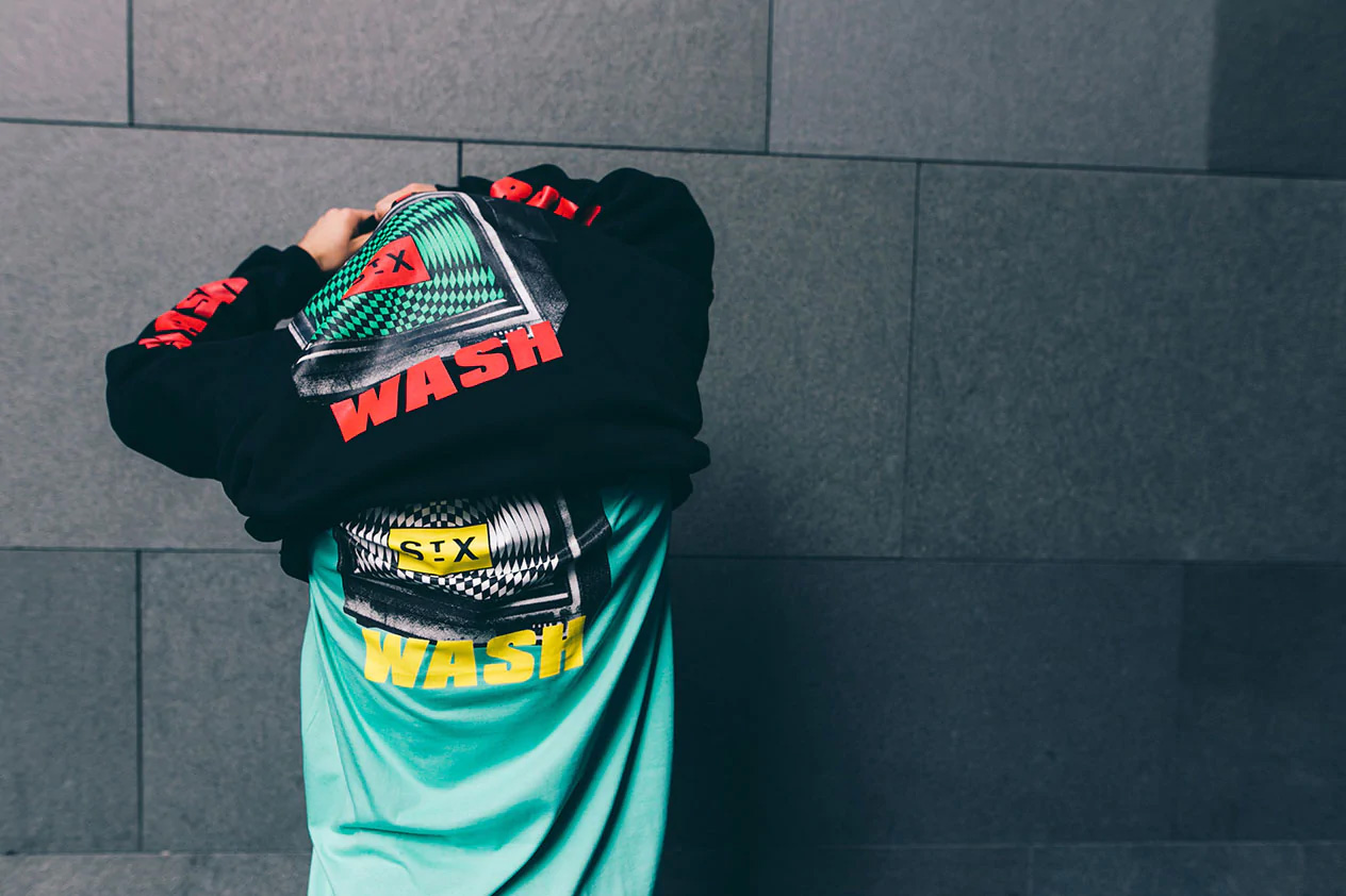
StreetX, Brand Identity and Direction
for the International Fashion Label
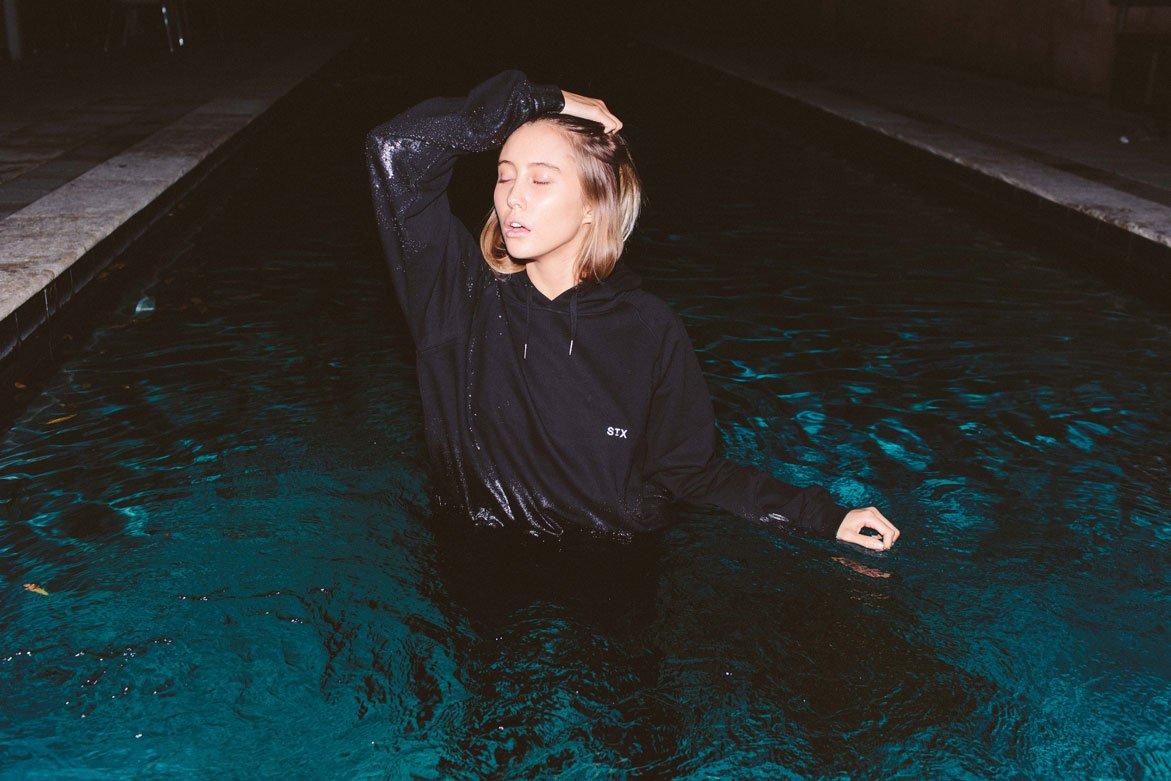
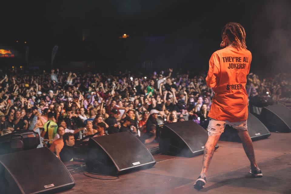
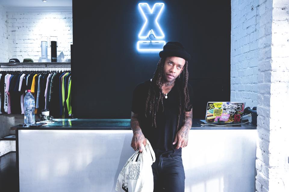
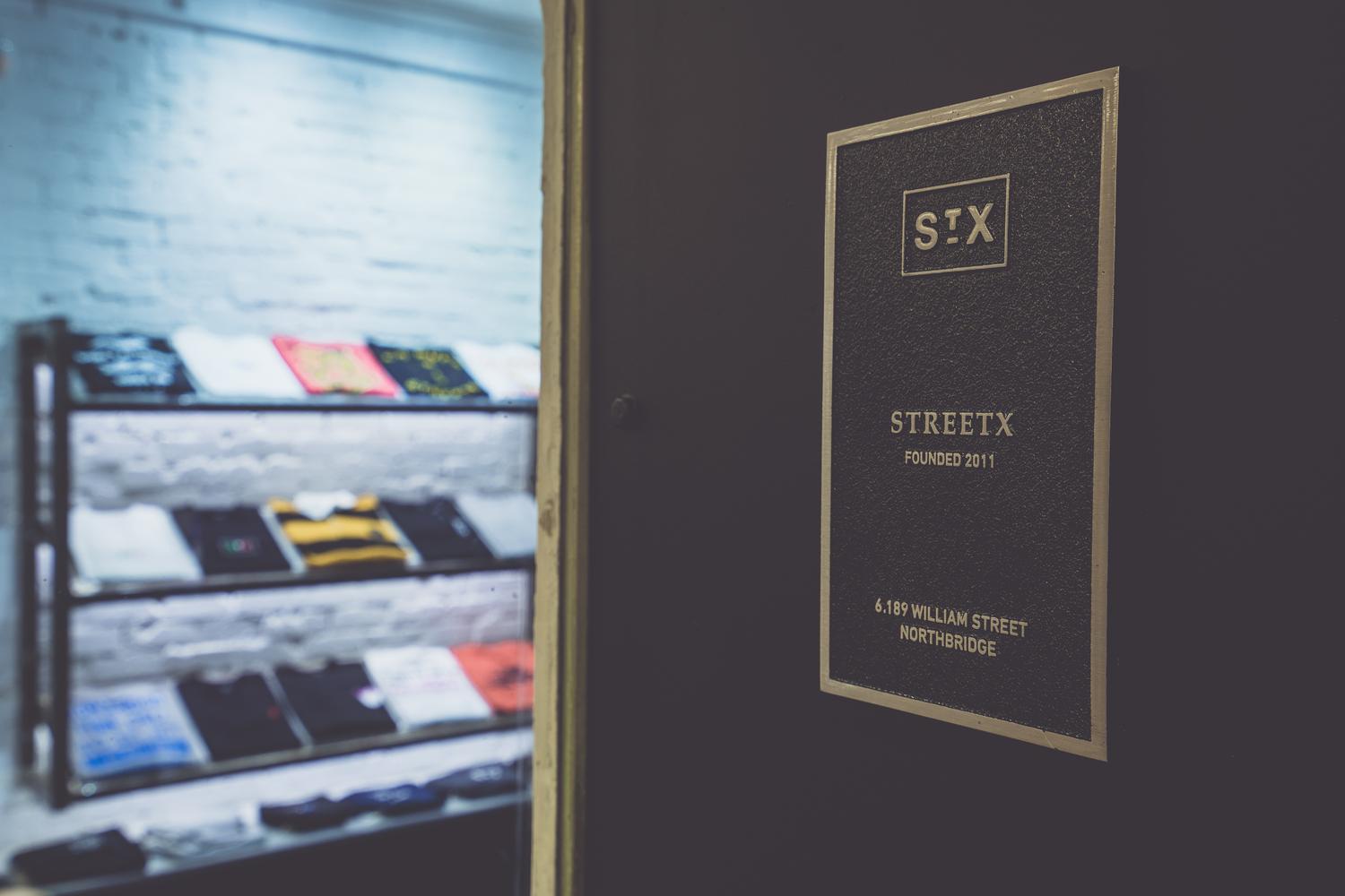

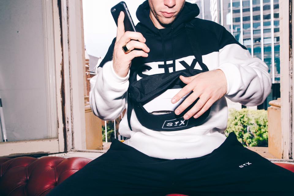
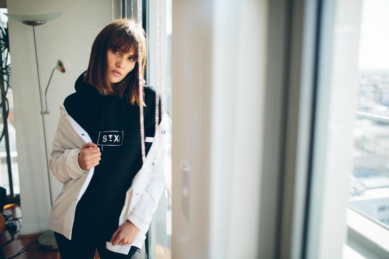
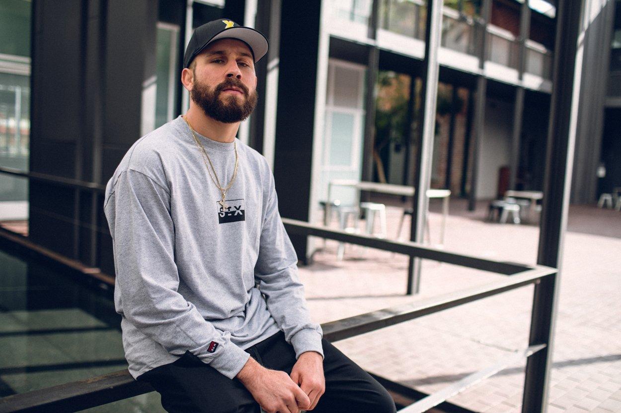


STREETX
Identity, Art Direction, Design
StreetX and StudioThinktank have had a close connection for many years, with StreetX founder Daniel Bradshaw and Thinktank owner Scott Mellor being long time friends.
The studio was initially engaged to develop brand identity for the then retail store. Almost all concepts for the branding ended up being used as tshirt designs, and the store shifted focus, concentrating on being a fashion label first, utilising the existing retail store to push their own product.
Scott moved to working internally with Daniel on the StreetX label, the pair taking the local retail store into an internationally recognised clothing label, with Scott creating the brand identity that is still in place today.
Scott ran the all art direction for the brand from 2013-2017, designing hundreds of garments, both print and cut and sew, travelling the world for production and promotion.
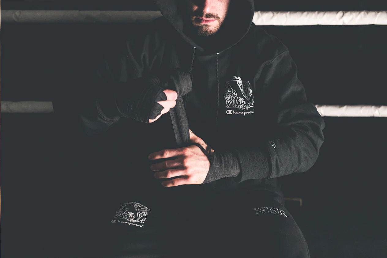
StreetX has featured on the worlds most prominent blogs and print publications, collaborating with scores of labels, from Champion USA to Rusty Surfboards.
After 5 years, Scott moved from his internal position within the StreetX brand to focus full time on StudioThinktank, however he continues to work with the label regularly designing ranges and individual garments.
StudioThinktank - Identity, Design, Art Direction
Rory Ferrante, Tom Sweetman - Graphic Design
Blu Builders - Store Fitout
Photos & Video by Adam Borrello, Sean Finney and Luc Clarke
Identity, Art Direction, Design
StreetX and StudioThinktank have had a close connection for many years, with StreetX founder Daniel Bradshaw and Thinktank owner Scott Mellor being long time friends.
The studio was initially engaged to develop brand identity for the then retail store. Almost all concepts for the branding ended up being used as tshirt designs, and the store shifted focus, concentrating on being a fashion label first, utilising the existing retail store to push their own product.
Scott moved to working internally with Daniel on the StreetX label, the pair taking the local retail store into an internationally recognised clothing label, with Scott creating the brand identity that is still in place today.
Scott ran the all art direction for the brand from 2013-2017, designing hundreds of garments, both print and cut and sew, travelling the world for production and promotion.
StreetX has featured on the worlds most prominent blogs and print publications, collaborating with scores of labels, from Champion USA to Rusty Surfboards.
After 5 years, Scott moved from his internal position within the StreetX brand to focus full time on StudioThinktank, however he continues to work with the label regularly designing ranges and individual garments.
StudioThinktank - Identity, Design, Art Direction
Rory Ferrante, Tom Sweetman - Graphic Design
Blu Builders - Store Fitout
Photos & Video by Adam Borrello, Sean Finney and Luc Clarke
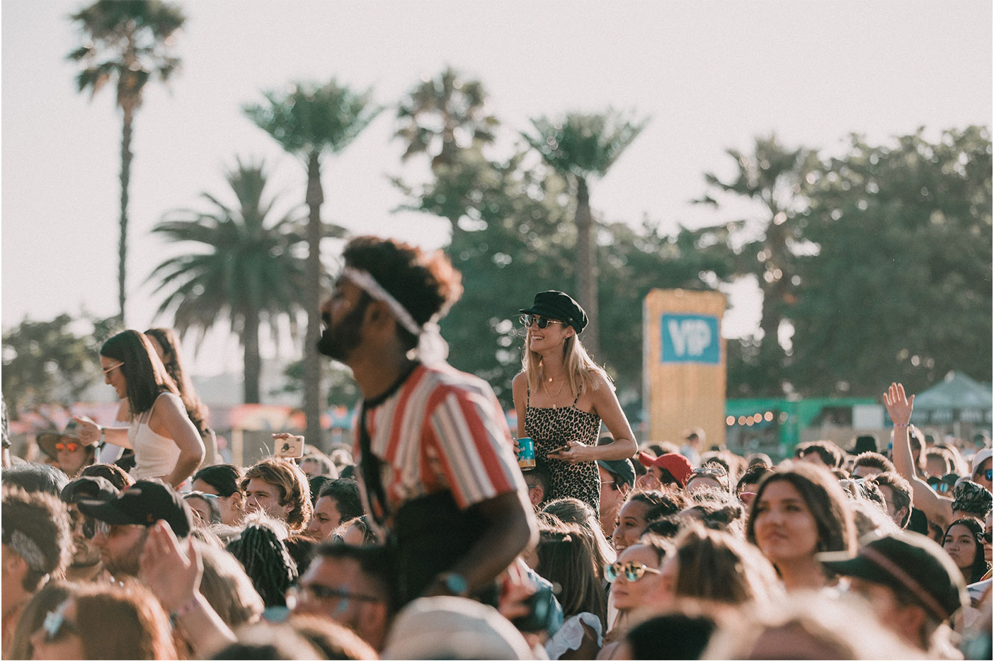
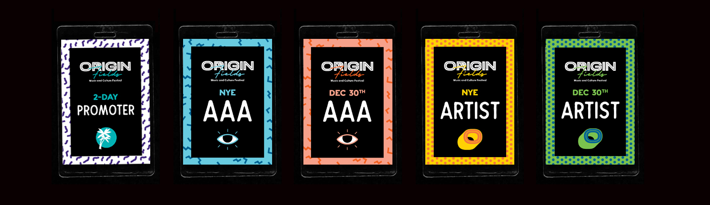
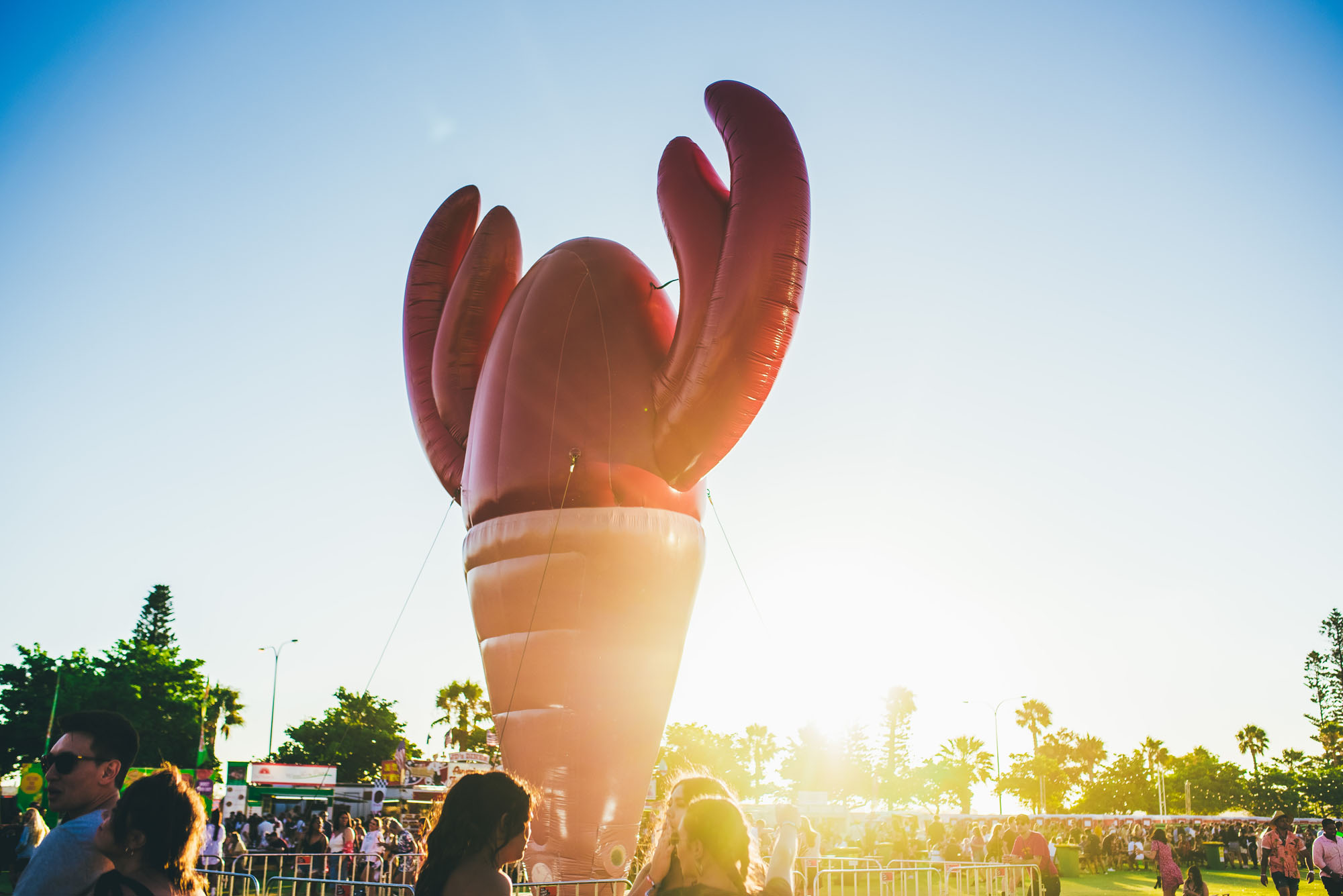
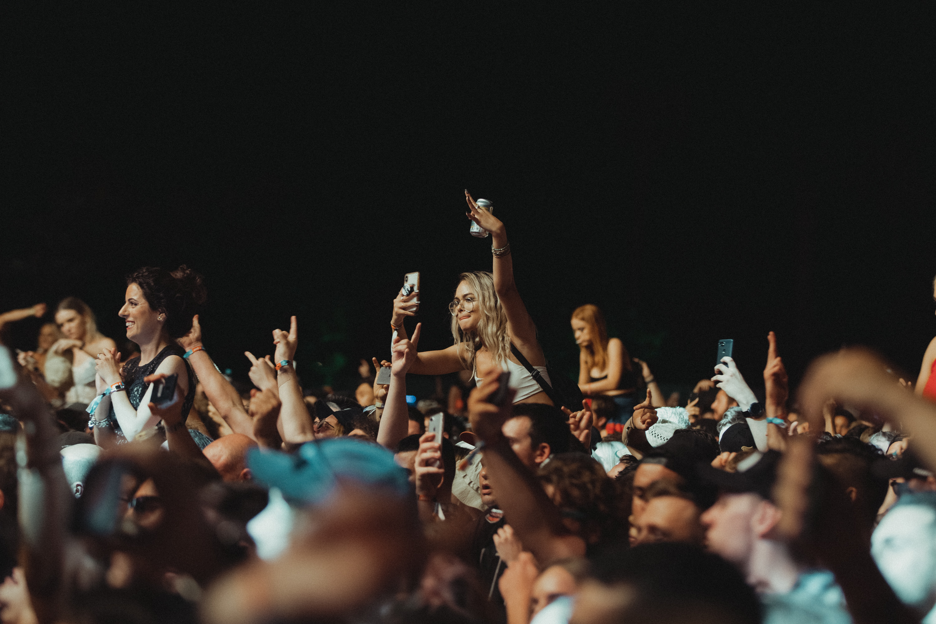
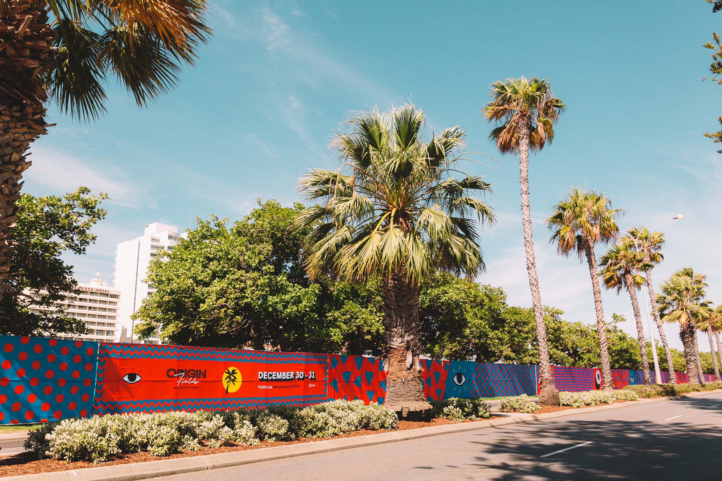
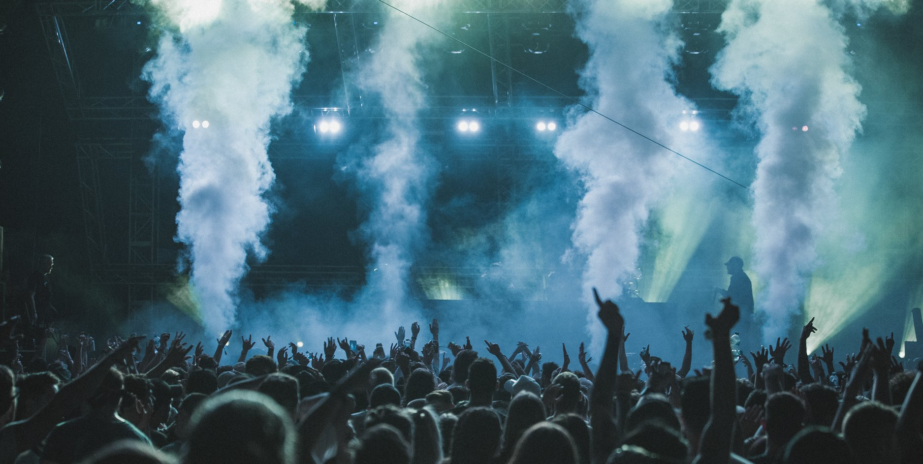
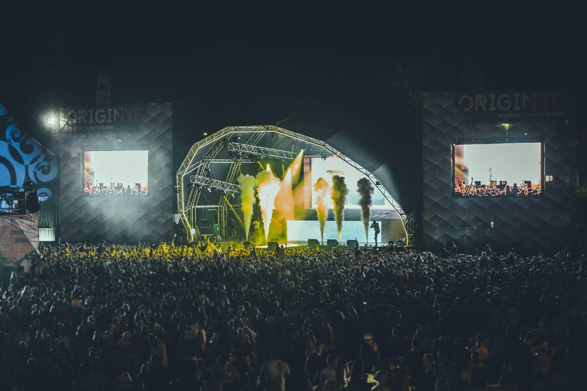
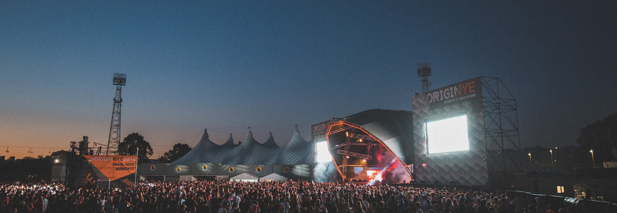
Origin Fields Festival 2018
An identity to take Australia’s biggest new years eve
festival to a multi day celebration


ORIGIN FIELDS MUSIC FESTIVAL, 2018
Creative Direction, Identity
StudioThinktank® were contracted to creatively direct Origin Festivals expansion from a single day to multi day festival in 2018.
Historically, Origin had been the premier New Years Eve music festival in Australia for the past 11 years. The company came to StudioThinktank with a grand idea, to take a festival that had previously been deep rooted in bass music, and expand it to a multi day festival encompassing both live and digital music acts in the form of a cultural festival experience.
First port of call was a rebrand. It was important not to alienate the existing following of the brand, so a brand expansion was preferred to a total rebrand. We decided to rename this iteration of the festival to Origin Fields, conjuring ideas of vast open spaces and summer sunshine.Origin had specified that they wanted a softer and more accessable style of art for this iteration of the festival. StudioThinktank® had been in charge of art direction for the project since first being contracted in 2014, and had built a dark and futurist aesthetic that had become synonimous with the festival. With the inception of Origin Fields, we opted for a vector illustration style graphic, with elements of the rolling grass fields of its new home in Langley park, wedged between the Perth City sky line and the Swan River.
StudioThinktank® saw the project through from inception to execution, creating and directing all assets including stage design, merchandise and festival grounds layout.
Scott Mellor - StudioThinktank - Creative Director
Made in the Pile - Video Production + Digital Marketing
Rory Ferrante - Additional Design
DGPR - Public Relations
Ticketbooth - Digital Aggregation
Cool Shit - Installation Art
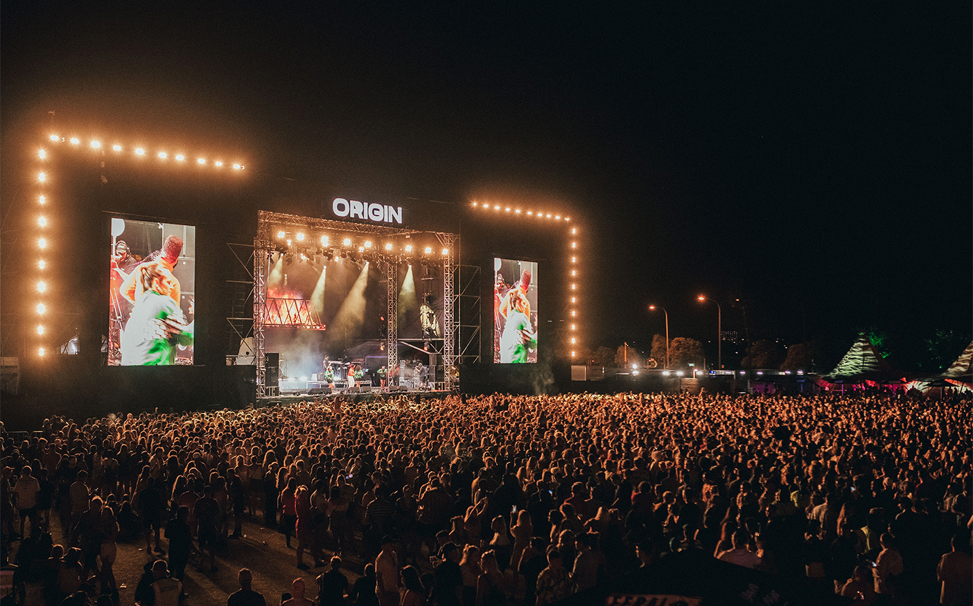
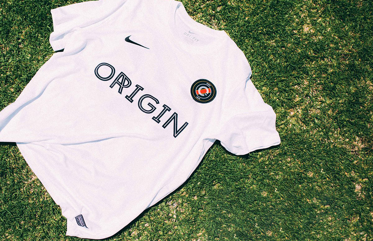
Origin Festival 2017
A three dimensional brand update for
the revered music and arts festival
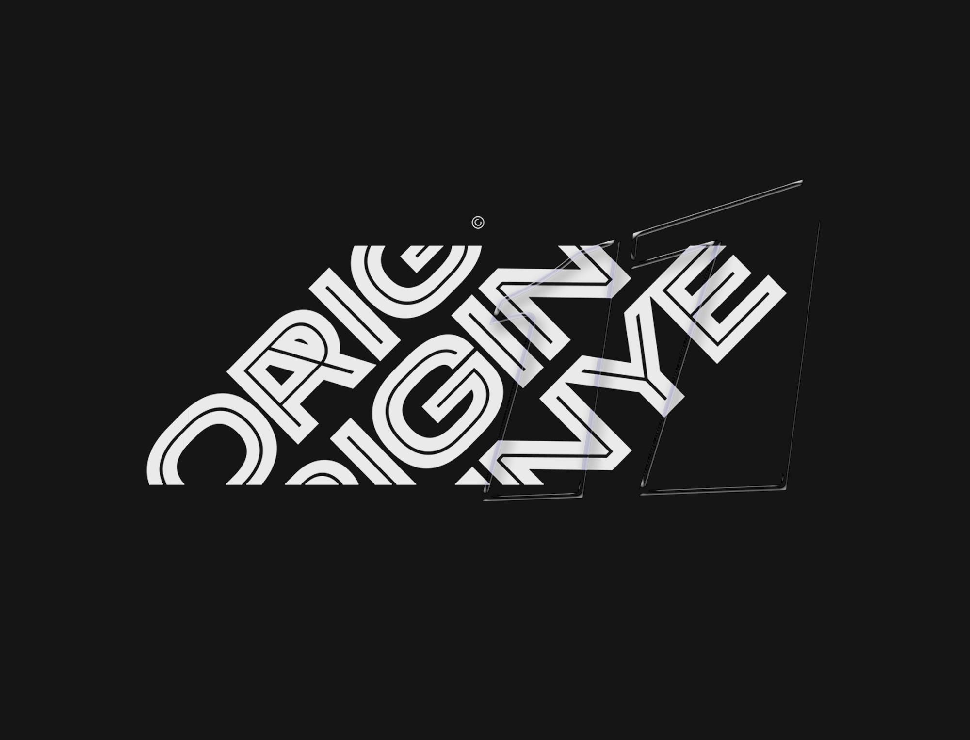
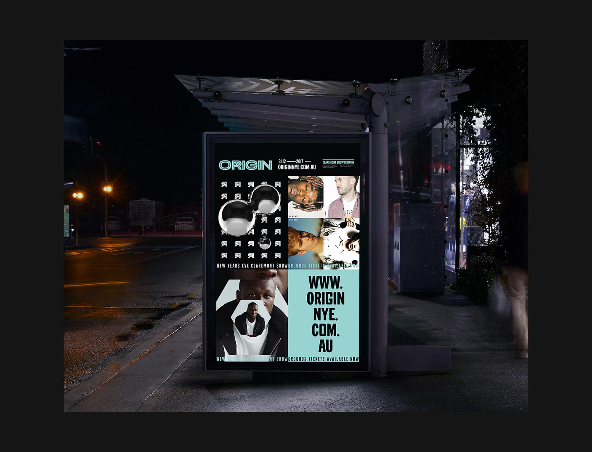

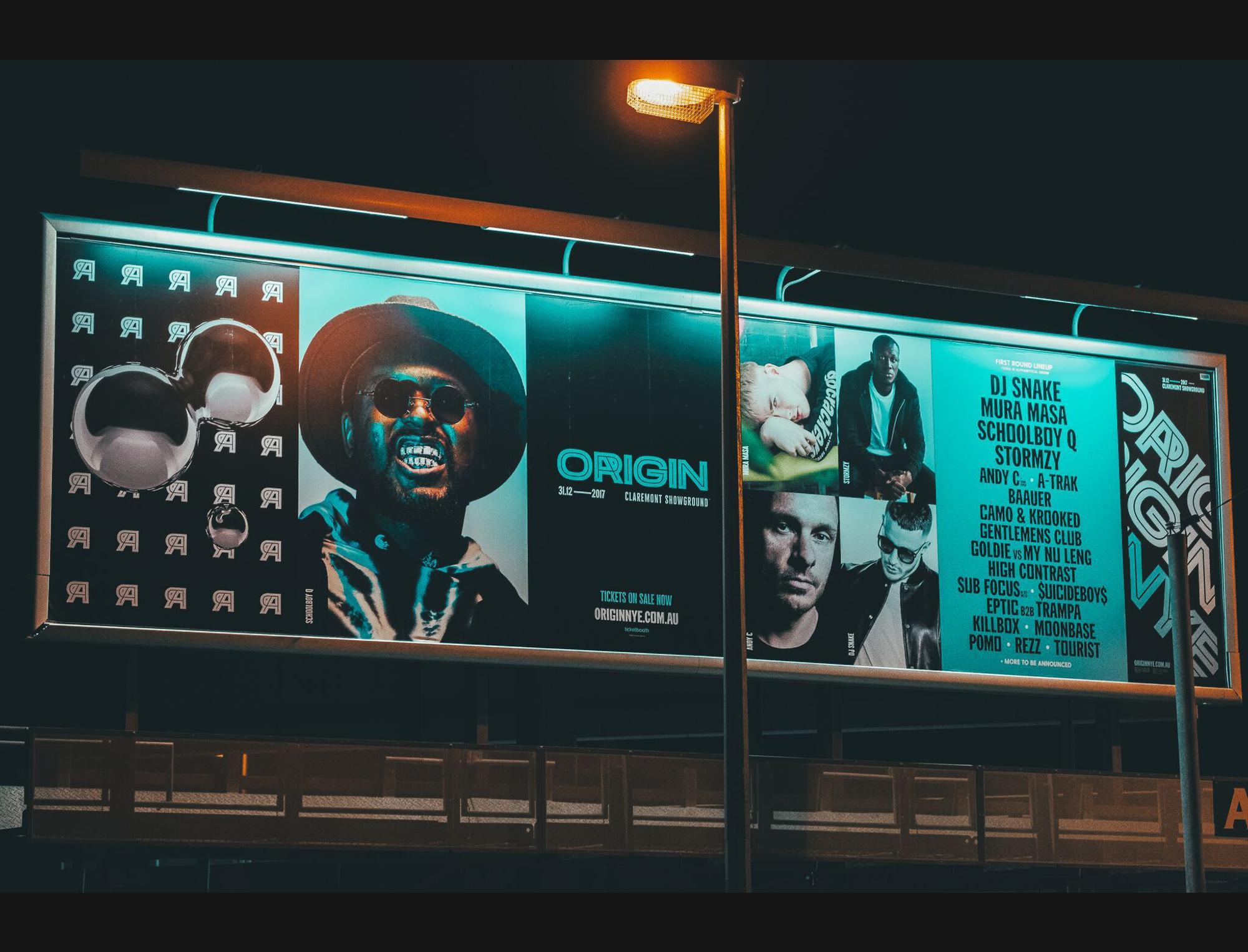


ORIGIN NYE FESTIVAL
Identity, Direction, Design (2017)
Following Origins 10th year anniversary in 2016, StudioThinktank were tasked with creating an updated identity for the festival, as well as an new campaign for the 2017 event. It was important to maintain a connection to the original branding, while modernising the typeface and creating a bolder, more adaptive logotype that could be easily identifiable across all communications. In a few short years, festival marketing matured from being a single bill poster, to a multifaceted digital campaign, as social media marketing exploded and the festival grew from a 5000 to a 25000 person event.
StudioThinktank - Direction, Design
Rory Ferante - 3D production
Adam Borrello - Video Production
Sean Finney - Video Production
Origin Festival 2016
Creating an identity and campaign for
the tenth anniversary of the southern
hemispheres largest new years eve festival
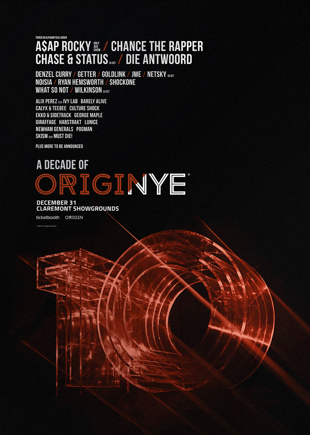


Origin NYE Festival 2016
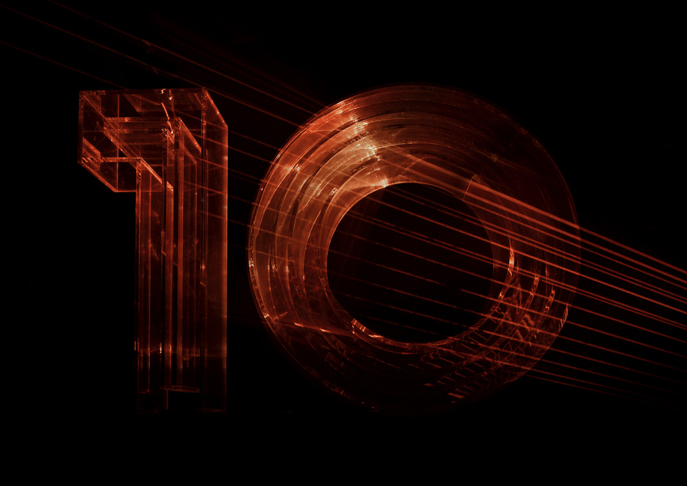
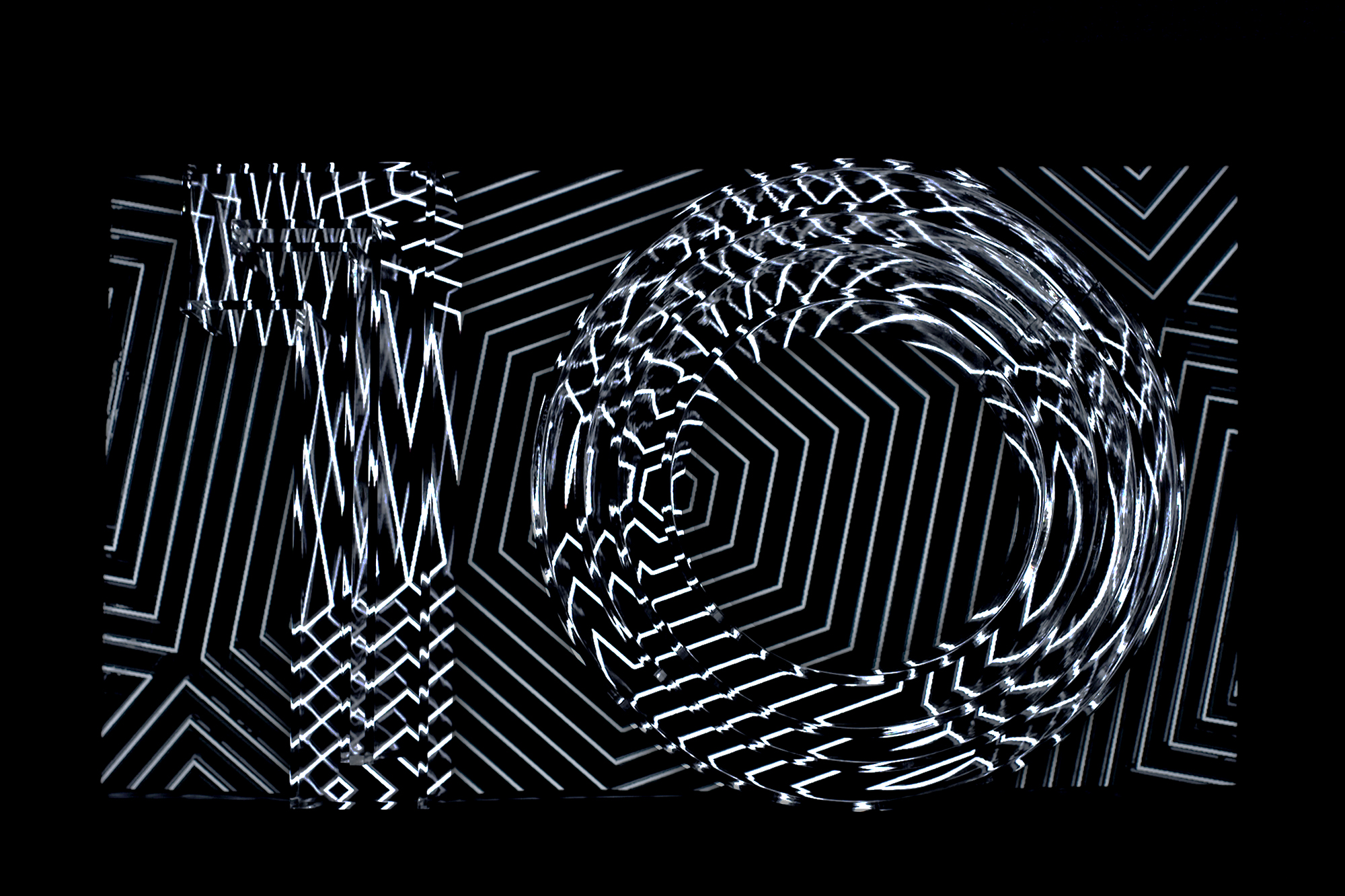
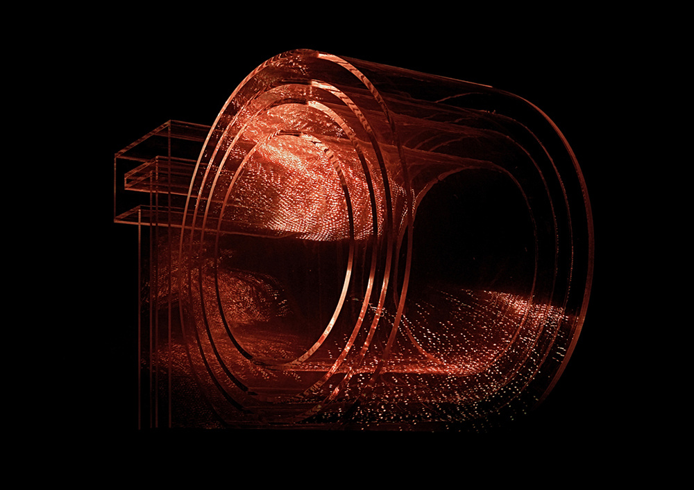
Creative Direction, Identity
Art direction for the ten year anniversary of Origin NYE Festival in Perth Australia.
Thinktank created a concept taking inspiration from simulation theory, working to create a physical artifact, utilising project various lighting effects and camera techniques to make it feel like it was created in a digital 3d space.
All imagery and motion used in the campaign was completely in camera. The campaign won bronze at the 47th Media & Interactive Design Awards