StudioThinktank, Work
LALA
A Visionary Identity for Perth’s New Open-Air Music Festival


LALA Open Air Festival [2023]
Creative Direction, Design, Identity, Campaign
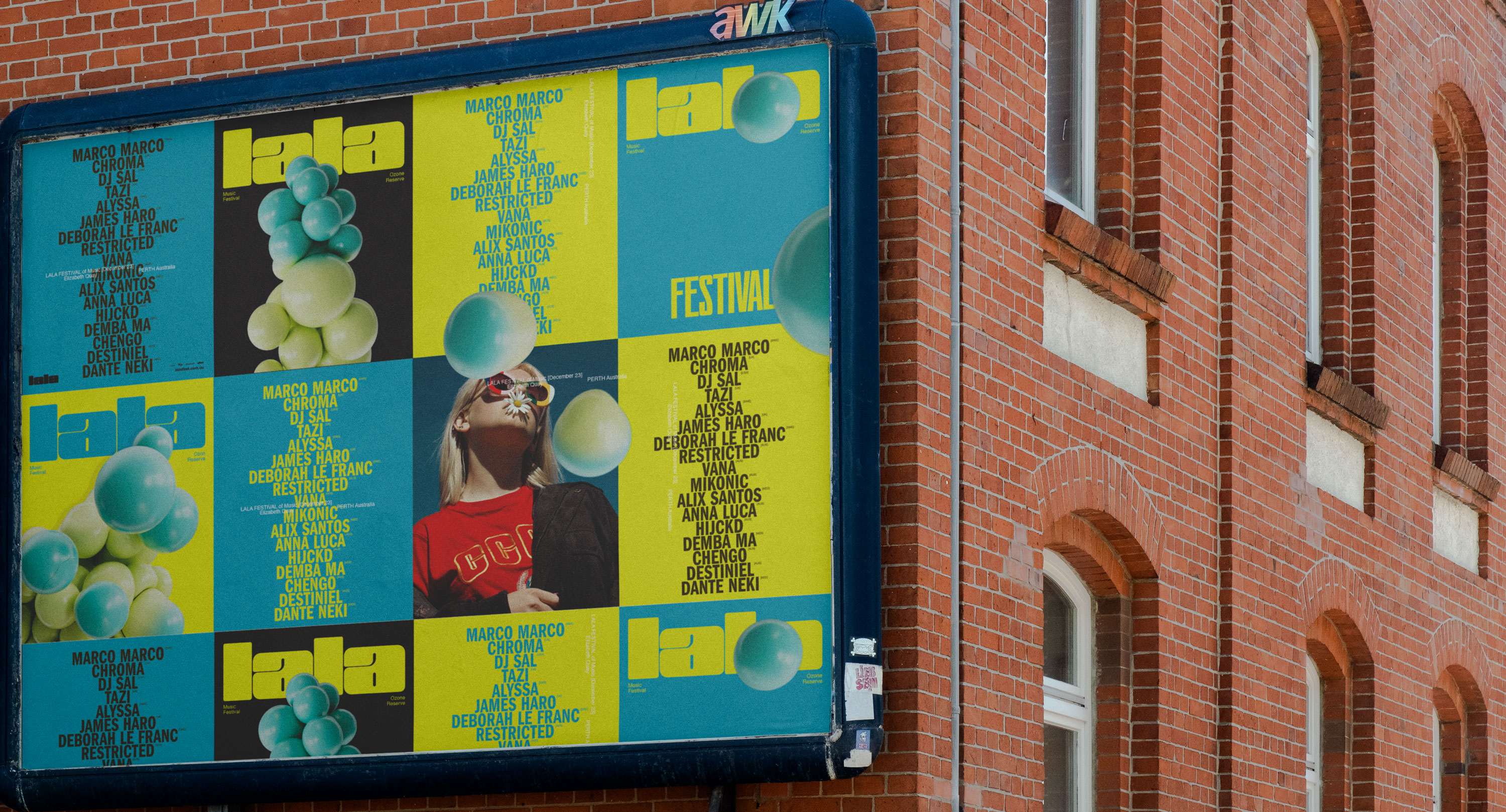
Launching a new open-air music festival in Perth presented a unique challenge: establishing a compelling brand presence in a saturated market without the support of pre-existing assets or past event visuals. The identity and year-one campaign required a thoughtful approach—one that would captivate audiences and create a cohesive visual narrative from the ground up.
A meticulously designed motion graphics suite became the cornerstone of the festival’s brand identity. This system ensured a unified voice across all touchpoints, maintaining consistency while allowing the supporting visuals to take center stage. The result was an identity that could stand independently, minimizing reliance on repetitive logotype placement and instead leaning into dynamic, recognizable brand elements.
Music festivals, by nature, operate within long marketing timelines, creating the risk of messaging fatigue over time. To counteract this, the identity system incorporated flexible, highly stylized design elements that sustained visual interest throughout the campaign. This approach ensured the brand remained dynamic and engaging from announcement through to the event’s culmination.
Entering the competitive festival market for the first time, the visual identity had to immediately capture attention and convey credibility. The campaign emphasized bold, memorable design to make a striking first impression, compensating for the absence of archival footage or photography.
The final result was a visually immersive and highly adaptable identity that amplified the festival’s presence across both digital and physical platforms, setting the stage for its inaugural year and beyond.